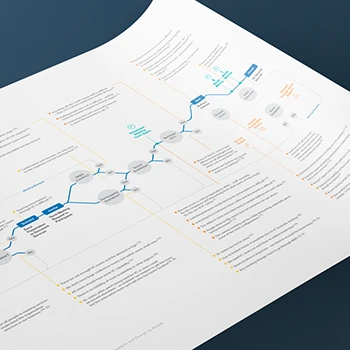
What makes infographics different from other visual content?
Infographics transform complex information into visually engaging narratives that capture attention and improve comprehension. Unlike simple charts or decorative graphics, effective infographics combine data visualization, storytelling, and strategic design to communicate key messages that might otherwise be ignored or misunderstood. They serve as a bridge between raw data and audience understanding, making information accessible to diverse audiences.
Tip: Define your core message before gathering data - the strongest infographics tell one clear story rather than trying to communicate everything at once.
When should we use infographics instead of other content formats?
Infographics work best when you need to simplify complex information, make data emotionally engaging, or create shareable content that captures attention in crowded digital environments. They're particularly effective for explaining processes, comparing options, presenting survey results, or communicating statistics that support your messaging goals. Following our Experience Thinking approach, infographics serve the content experience by making information more digestible and memorable.
Tip: Use infographics when your audience needs to understand relationships between data points or when you want to increase content sharing and engagement.
What types of information work best in infographic format?
Statistical data, process flows, comparisons, timelines, and research findings translate well into infographic format. Information that benefits from visual hierarchy, color coding, or spatial relationships becomes more accessible when presented graphically. However, the key is ensuring your data has a clear narrative structure and supports specific communication goals rather than just displaying numbers attractively.
Tip: Audit your existing content to identify complex explanations, lengthy lists, or data-heavy sections that could be more engaging as infographics.
How do infographics fit into our broader content strategy?
Using Experience Thinking content strategy principles, infographics should integrate seamlessly with your overall communication ecosystem. They can repurpose existing research, support blog posts, enhance presentations, and provide social media content while maintaining consistent messaging and visual identity. Effective infographics extend the reach and impact of your core content by making it more accessible and shareable across multiple channels.
Tip: Plan infographics as part of your content calendar rather than afterthoughts - they can amplify the impact of your research and thought leadership content.
What's the difference between data visualization and infographic design?
Data visualization focuses on accurate representation of information through charts, graphs, and diagrams. Infographic design combines data visualization with storytelling, branding, and strategic communication to create engaging narratives. While data visualization prioritizes accuracy and functionality, infographics balance accuracy with emotional engagement and brand expression to serve broader communication goals.
Tip: Start with solid data visualization principles for accuracy, then layer on storytelling and design elements that support your communication objectives.
How do you ensure infographics remain accessible to diverse audiences?
Accessibility requires careful attention to color contrast, font sizes, alternative text descriptions, and clear visual hierarchy. We design infographics that work for colorblind users, screen readers, and mobile devices while maintaining visual appeal. Following our design principles, we ensure information remains clear and understandable across different abilities and technological constraints without compromising aesthetic quality.
Tip: Test your infographics with screen readers and in grayscale to ensure critical information is still accessible when color or visual elements can't be perceived.
What role do infographics play in digital marketing and engagement?
Infographics significantly increase content sharing, engagement, and retention compared to text-only content. They perform well on social media, enhance email marketing campaigns, and improve website engagement metrics. As part of your broader Experience Thinking approach, infographics create touchpoints that build brand recognition while delivering valuable information that establishes thought leadership and expertise.
Tip: Create multiple sized versions of your infographics optimized for different platforms - LinkedIn, Instagram, and Twitter each have different optimal dimensions and reading patterns.
What's your strategic approach to infographic design projects?
Our process follows Experience Thinking methodology, beginning with understanding your audience, objectives, and the story your data tells. We start with content strategy and information architecture before moving to visual design, ensuring every design decision serves your communication goals. This approach prevents attractive but ineffective infographics that look good but fail to communicate clearly.
Tip: Prepare a clear brief that includes your target audience, key messages, and intended use cases before starting the design process.
How do you research and organize complex information for infographic design?
Information research involves content auditing, source verification, and message prioritization using our content strategy framework. We analyze your data to identify key insights, create logical information hierarchies, and develop narrative structures that guide readers through complex information. This research phase ensures accuracy while identifying the most compelling story your data can tell.
Tip: Gather all relevant data sources and let the design team help identify the most interesting patterns and insights rather than pre-determining what the infographic should emphasize.
What's your approach to visual hierarchy in infographic design?
Visual hierarchy guides readers through information using size, color, spacing, and positioning to emphasize important points and create logical reading flows. We apply user experience principles to ensure readers can quickly identify key messages while providing paths for deeper engagement with supporting details. Every visual element serves a specific communication purpose rather than just aesthetic appeal.
Tip: Identify the three most important takeaways from your infographic and ensure these are the most visually prominent elements in the design.
How do you balance aesthetic appeal with information accuracy?
Accuracy always takes priority, but we achieve visual appeal through thoughtful design rather than data manipulation. We use design elements like color, typography, and layout to enhance comprehension while maintaining data integrity. Following our design principles, we create emotionally engaging visuals that support rather than distort the underlying information, building trust while capturing attention.
Tip: Establish data accuracy standards upfront and provide source documentation to ensure design choices support rather than compromise factual integrity.
What collaboration do you need from our team during the design process?
Successful infographic projects require subject matter expertise, data verification, and feedback on message clarity from your team. We need access to reliable data sources, understanding of audience context, and approval at key milestones to ensure accuracy and relevance. Your team's knowledge combined with our design expertise creates infographics that are both visually compelling and substantively sound.
Tip: Identify internal experts who can verify data accuracy and provide context about industry nuances that external designers might miss.
How do you handle revisions and iteration during infographic development?
Our iterative process includes concept development, draft review, and refinement phases that allow for feedback and improvements. We present initial concepts that explore different approaches to your content, then refine based on your input while maintaining design quality and message clarity. Clear communication and structured feedback help ensure final deliverables meet your objectives.
Tip: Provide specific feedback about content accuracy and message clarity rather than detailed design preferences - focus on whether the infographic communicates effectively to your audience.
What timeline should we expect for infographic design projects?
Most infographic projects require 3-5 weeks from concept through final delivery, depending on complexity and content requirements. This includes research and strategy, design development, review cycles, and file preparation. Complex data analysis or multiple stakeholder approvals may extend timelines, so early planning and clear approval processes help maintain project schedules.
Tip: Allow extra time for data gathering and verification - incomplete or inaccurate source material is the most common cause of project delays.
How do you determine the best story structure for our data?
Story structure emerges from data analysis combined with audience needs and communication objectives. Using Experience Thinking content principles, we identify the most compelling insights your data reveals, then create narrative frameworks that guide readers from problem to solution or cause to effect. The strongest infographics tell focused stories rather than comprehensive overviews.
Tip: Start with your conclusion or key insight, then work backward to determine what supporting information readers need to understand and believe your main message.
What's your approach to simplifying complex information without losing accuracy?
Simplification involves strategic omission and clear explanation rather than oversimplification that distorts meaning. We identify essential information that supports your core message, then present it using clear language, logical groupings, and progressive disclosure. Following our content design principles, we maintain accuracy while making information accessible to non-expert audiences.
Tip: Focus on the implications of your data rather than just the raw numbers - help readers understand what the information means for them or their decisions.
How do you ensure consistency with our brand voice and messaging?
Brand consistency requires understanding your organization's personality, values, and communication style, then reflecting these through content tone, visual style, and message framing. Within our Experience Thinking framework, infographics become part of your broader brand experience, reinforcing rather than contradicting your established voice while serving specific communication objectives.
Tip: Share examples of existing content that reflects your preferred tone and messaging style to guide both written and visual elements of the infographic.
What research methods do you use to understand our target audience?
Audience research includes stakeholder interviews, persona analysis, and review of existing audience data to understand knowledge levels, preferences, and consumption patterns. We examine how your audience currently interacts with similar content to inform design decisions about complexity, visual style, and information presentation that will resonate most effectively.
Tip: Provide examples of content that has performed well with your audience, including metrics about engagement and sharing patterns when available.
How do you structure information for different reading patterns and attention spans?
Information structure accommodates both scanners who want quick insights and deep readers who want detailed understanding. We create multiple entry points, clear headlines, and logical progression that allows different engagement levels. Visual design supports various reading patterns while ensuring key messages reach readers regardless of how thoroughly they engage with the content.
Tip: Design for mobile-first consumption since many readers will encounter your infographic on small screens with limited attention spans.
What content governance do you establish for ongoing infographic series?
Series governance includes style guides, content standards, and approval processes that ensure consistency across multiple infographics. Following our content governance framework, we establish templates, messaging guidelines, and quality standards that enable efficient production while maintaining brand consistency and communication effectiveness over time.
Tip: Plan for series consistency from the first infographic - establish visual and content standards that can scale across multiple pieces rather than designing each as a standalone project.
How do you handle sensitive or controversial information in infographic design?
Sensitive content requires careful framing, balanced presentation, and transparent sourcing to maintain credibility while addressing difficult topics. We focus on factual accuracy, provide context for data interpretation, and avoid inflammatory language or visuals while still creating engaging content. The goal is informing rather than persuading when dealing with contentious subjects.
Tip: Clearly cite sources and provide methodology information for any data that might be questioned or interpreted differently by various audiences.
How do you choose the right visual metaphors and icons for complex concepts?
Visual metaphors must be universally understood, culturally appropriate, and accurately represent the concepts they symbolize. We test metaphor clarity with diverse audiences and avoid imagery that might confuse or alienate readers. Following our visual design principles, we choose symbols that enhance rather than replace clear text explanations, ensuring accessibility across different cultural and educational backgrounds.
Tip: Avoid overly clever metaphors that might confuse your audience - clarity should always take priority over creativity when representing important information.
What's your approach to color psychology and accessibility in infographic design?
Color choices balance emotional impact with accessibility requirements, ensuring information remains clear for colorblind users while supporting your communication goals. We consider cultural color associations, brand consistency, and contrast requirements when developing color palettes. Every color decision serves both aesthetic and functional purposes in guiding attention and conveying meaning.
Tip: Test your infographic in grayscale to ensure critical information isn't lost if color can't be perceived or reproduced accurately.
How do you ensure typography enhances rather than hinders comprehension?
Typography choices prioritize readability while supporting visual hierarchy and brand expression. We select fonts that remain legible at various sizes, work across digital and print formats, and reinforce your brand personality. Text sizing, spacing, and contrast all contribute to information accessibility while maintaining visual appeal and professional appearance.
Tip: Plan for the smallest size your infographic will be viewed - social media thumbnails and mobile screens require larger text than you might initially expect.
What techniques do you use to make data visualization both accurate and engaging?
Engaging data visualization combines accurate representation with design elements that help viewers understand significance and context. We use appropriate chart types, clear labeling, and contextual information that helps readers interpret data correctly while maintaining visual interest. Design enhancements support rather than distort the underlying information.
Tip: Include context like baselines, benchmarks, or historical comparisons to help readers understand whether your data represents good or concerning performance.
How do you optimize infographics for different distribution channels and formats?
Multi-channel optimization requires creating versions tailored to specific platform requirements while maintaining core message consistency. We develop responsive designs, multiple aspect ratios, and file formats that work across web, print, social media, and presentation contexts. Each version preserves essential information while optimizing for its intended viewing context.
Tip: Prioritize your primary distribution channel for the main design, then create optimized versions rather than trying to make one design work perfectly everywhere.
What role does AI play in your infographic design process?
AI tools enhance our design efficiency through initial concept exploration, data pattern recognition, and design element generation, but human judgment drives strategic decisions about messaging, accuracy, and audience appropriateness. We use AI for tasks like color palette generation and layout exploration while ensuring final designs reflect authentic brand voice and accurate information interpretation.
Tip: Use AI for inspiration and efficiency, but always verify that automated design choices align with your brand standards and communication objectives.
How do you handle complex data sets that don't fit standard chart formats?
Complex data requires custom visualization approaches that maintain accuracy while creating comprehensible presentations. We analyze data relationships to identify the most appropriate visual representations, whether through innovative chart types, interactive elements, or multi-layered designs. The goal is making complex information accessible without oversimplifying important nuances.
Tip: Break complex data into smaller, related visualizations rather than trying to show everything in one chart - multiple simple visuals often communicate better than one complex diagram.
What file formats and resolutions do you provide for different use cases?
We deliver infographics in multiple formats optimized for specific uses: high-resolution PDFs for print, web-optimized PNGs and JPEGs for digital use, and vector files for future editing. Each format is optimized for its intended application while maintaining visual quality and ensuring compatibility across different systems and platforms.
Tip: Specify all intended uses upfront so we can optimize file formats accordingly - adding new use cases later may require additional optimization work.
How do you ensure infographics remain editable for future updates?
Editable deliverables include source files with organized layers, font documentation, and style guides that enable future modifications. We structure files logically and provide documentation that allows your team or other designers to make updates while maintaining visual consistency and quality standards.
Tip: Establish a clear plan for who will handle future updates and what level of design expertise they have - this affects how we structure source files and documentation.
What quality assurance processes ensure accuracy and visual consistency?
Quality assurance includes data verification, proofing cycles, cross-platform testing, and accessibility checks before final delivery. We review content accuracy, visual consistency, and technical specifications to ensure deliverables meet professional standards and function correctly across intended applications. Multiple review stages prevent errors and ensure quality.
Tip: Assign someone from your team to verify data accuracy and provide final approval - fresh eyes often catch errors that both designers and subject matter experts might miss.
How do you handle version control and revision tracking during projects?
Version control systems track changes, maintain revision history, and ensure all stakeholders work with current files. We document all modifications, maintain backup versions, and provide clear file naming that prevents confusion during collaborative review processes. This prevents lost work and ensures accountability throughout the project.
Tip: Establish a single point of contact for feedback consolidation to prevent conflicting revision requests and ensure clear communication about changes.
What support do you provide for printing and production requirements?
Print production support includes color profile management, resolution optimization, and technical specifications that ensure quality reproduction across different printing methods. We provide print-ready files and can coordinate with printing services to resolve technical issues that might affect final quality.
Tip: Share printing specifications early in the process if high-quality print reproduction is important - some design choices that work well digitally may not translate effectively to print.
How do you optimize file sizes for web and mobile distribution?
Web optimization balances visual quality with loading speed through compression techniques, appropriate file formats, and responsive design considerations. We create versions optimized for different connection speeds and device capabilities while maintaining readability and visual impact across various viewing conditions.
Tip: Test infographic loading on mobile devices with slower connections to ensure accessibility for all potential viewers, not just those with high-speed internet.
What analytics and performance tracking do you recommend for infographics?
Performance tracking includes engagement metrics, sharing rates, and conversion measurements that help assess infographic effectiveness. We recommend tracking methods appropriate to your distribution channels and provide guidance on measuring success against your communication objectives. Data helps optimize future infographic strategies.
Tip: Establish baseline metrics before launching new infographics to measure improvement and identify which content formats and topics resonate most with your audience.
How do infographics support our broader marketing and communication goals?
Infographics amplify your content marketing by making information more shareable, memorable, and accessible to diverse audiences. Within the Experience Thinking framework, they create valuable touchpoints that build brand recognition while establishing thought leadership through clear communication of complex ideas. They extend the reach and impact of your research and expertise.
Tip: Align infographic topics with your content calendar and SEO strategy to maximize their impact on your broader marketing objectives.
What measurable business outcomes can result from effective infographic design?
Effective infographics can increase website engagement, social media shares, lead generation, and brand awareness while reducing the time needed to communicate complex information. They support sales processes, enhance presentations, and improve stakeholder understanding of key business metrics or value propositions.
Tip: Track specific metrics like download rates, sharing statistics, and referral traffic to measure ROI and inform future infographic investments.
How do you ensure infographics remain relevant and useful over time?
Longevity requires focusing on enduring insights rather than time-sensitive data, creating modular designs that can be updated, and choosing topics with lasting relevance to your audience. We design with future updates in mind and provide guidelines for maintaining accuracy and relevance as information evolves.
Tip: Focus on principles, processes, and insights that won't become outdated quickly rather than highly specific statistics that may change frequently.
What role do infographics play in thought leadership and industry positioning?
Infographics establish expertise by making complex industry insights accessible to broader audiences, demonstrating deep understanding of important topics, and providing valuable resources that others want to share and reference. They position your organization as knowledgeable and helpful while building trust through clear, accurate communication.
Tip: Address common industry misconceptions or provide new perspectives on familiar topics to create infographics that generate discussion and establish your expertise.
How do you measure long-term brand impact from infographic initiatives?
Long-term impact measurement includes brand recognition studies, audience engagement tracking, and assessment of how infographics contribute to overall communication effectiveness. We establish baseline metrics and monitoring systems that connect infographic performance to broader brand and business objectives over time.
Tip: Survey your audience periodically to understand which content formats they find most helpful and memorable for measuring long-term communication impact.
What competitive advantages can result from superior infographic design?
Superior infographic design differentiates your organization through clearer communication, more engaging content, and better audience education than competitors provide. Quality design demonstrates attention to detail and commitment to audience value while making complex information more accessible than competitor communications.
Tip: Analyze competitor content to identify opportunities for clearer explanation or more engaging presentation of similar topics rather than just copying their approaches.
How do infographics contribute to building audience trust and credibility?
Trust building through infographics requires accurate information, transparent sourcing, balanced presentation, and professional design quality that reflects organizational credibility. Following Experience Thinking principles, infographics become trust-building touchpoints that demonstrate expertise while providing genuine value to your audience rather than just promotional messaging.
Tip: Include source citations and methodology information where appropriate to build credibility, especially when presenting research findings or industry statistics.
What training do you provide for our team to maximize infographic impact?
Training includes best practices for infographic distribution, social media optimization, and integration with existing content strategies. We provide guidelines for maintaining quality standards when creating future infographics and help your team understand how to measure and optimize performance across different channels and objectives.
Tip: Designate internal champions who can maintain design standards and coordinate infographic initiatives across different departments and campaigns.
How do you help us develop internal capabilities for ongoing infographic creation?
Capability development includes template creation, style guide development, and training that enables your team to produce quality infographics independently. We establish design systems and processes that maintain consistency while building internal expertise for future projects that don't require external design support.
Tip: Start with simple template-based approaches for internal team members before advancing to more complex custom design capabilities.
What ongoing consultation do you provide for infographic strategy and optimization?
Ongoing consultation includes performance review, strategy refinement, and guidance for expanding infographic initiatives based on results and changing business needs. We help optimize distribution strategies, identify new opportunities, and ensure infographic efforts continue supporting your communication goals effectively over time.
Tip: Schedule quarterly reviews of infographic performance to identify successful patterns and optimize future content planning and design approaches.
How do you ensure successful integration with our existing content and design systems?
Integration requires understanding your current brand standards, content workflows, and approval processes, then designing infographics that fit seamlessly within existing systems. We work with your team to establish processes that maintain quality while fitting within your operational constraints and brand requirements.
Tip: Involve your existing design and marketing teams early in the process to ensure infographics align with current standards and workflows.
What project management approach ensures successful infographic delivery?
Project management includes clear milestone planning, stakeholder communication, and quality control processes that ensure on-time delivery while maintaining design quality and content accuracy. We use collaborative tools and regular check-ins to keep projects on track and address issues before they impact deadlines.
Tip: Establish clear approval processes and decision-making authority upfront to prevent delays caused by unclear feedback or conflicting stakeholder input.
How do you handle multiple infographic projects and maintain consistency across series?
Series management requires design systems, content standards, and production workflows that ensure consistency while allowing appropriate variation for different topics and audiences. We establish templates and guidelines that enable efficient production while maintaining quality and brand consistency across multiple projects.
Tip: Plan series consistency from the beginning rather than trying to retrofit consistency across independently designed pieces.
What post-launch support do you provide for optimization and performance improvement?
Post-launch support includes performance analysis, optimization recommendations, and guidance for improving future infographic initiatives based on real-world results. We help interpret analytics data, identify improvement opportunities, and refine strategies for better communication effectiveness and audience engagement.
Tip: Set up tracking systems before launch to establish baseline performance and enable meaningful comparison of optimization efforts over time.


