What makes effective data visualization design different from standard chart templates?
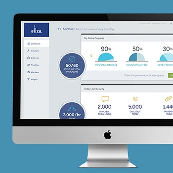
Effective data visualization design goes beyond applying templates to create meaningful insights that support decision-making. Our Experience Thinking approach considers how visualizations connect to brand strategy, content goals, product functionality, and service delivery. We design visualizations that tell compelling stories, reveal patterns, and guide users toward actionable insights rather than simply displaying data in familiar chart formats.
Tip: Evaluate visualization partners based on their ability to connect data insights to your business strategy rather than just technical chart-building capabilities.
How do you approach data visualization strategy for complex business intelligence?
Complex business intelligence requires understanding both data relationships and user decision-making processes. We start by mapping user workflows, identifying key performance indicators, and understanding how different stakeholders use data for different purposes. Our Experience Thinking framework ensures visualizations support brand consistency, content hierarchy, product usability, and service delivery insights across the organization.
Tip: Focus on visualization strategies that align with how different user roles actually make decisions rather than creating comprehensive dashboards that try to serve everyone equally.
What role does foresight design play in data visualization planning?
Foresight design helps anticipate how data needs, technology capabilities, and user expectations will evolve. We design visualization frameworks that can adapt to changing data sources, emerging interaction methods, and future analytical requirements. This approach ensures your visualization investments remain valuable as your organization grows and data landscape becomes more sophisticated.
Tip: Plan visualization architectures that can accommodate new data sources and analysis types rather than building rigid systems around current requirements.
How do you balance analytical depth with visual clarity in dashboard design?
Effective dashboard design requires understanding user expertise levels and decision-making contexts. We use progressive disclosure principles, contextual drill-down capabilities, and layered information architecture to provide both overview insights and detailed analysis when needed. Our approach ensures novice users can understand key trends while expert users can access the analytical depth they require.
Tip: Design dashboards with multiple interaction levels rather than trying to show all available data at once or oversimplifying complex information.
What's your approach to data storytelling in visualization design?
Data storytelling transforms numbers into narratives that drive action. We structure visualizations to guide users through logical progressions, highlight significant insights, and provide context for interpretation. Our Experience Thinking approach ensures data stories align with brand messaging, support content strategy, enhance product understanding, and improve service delivery decisions.
Tip: Focus on designing visualizations that answer specific business questions rather than creating general-purpose data displays that leave interpretation entirely to users.
How do you ensure data visualizations support different organizational roles?
Different roles require different perspectives on the same data. Executives need strategic overviews, analysts need detailed trends, and operational staff need real-time indicators. We design role-based visualization frameworks that present relevant insights for each user type while maintaining data consistency and enabling cross-functional collaboration when needed.
Tip: Map visualization requirements to specific job functions and decision types rather than assuming one dashboard design can effectively serve all organizational levels.
What considerations guide your choice of visualization types for different data sets?
Visualization type selection depends on data characteristics, user goals, and cognitive processing patterns. We match chart types to data relationships, consider cultural reading patterns, and ensure visualizations support the intended analytical tasks. Our approach includes testing visualization effectiveness with actual users to validate that chosen formats successfully communicate insights.
Tip: Test different visualization approaches with your actual users rather than relying on general design conventions or personal preferences.
How do you research user needs for data visualization design?
Understanding visualization needs requires examining both data usage patterns and decision-making workflows. We conduct contextual interviews, job shadowing, and task analysis to understand how users currently interpret data and where visualization could improve their effectiveness. Our research explores not just what data people need, but how they process information and make decisions based on insights.
Tip: Include observation of current data usage behavior in your research rather than only asking users about their visualization preferences.
What methods do you use to validate visualization effectiveness?
Visualization validation combines usability testing with comprehension assessment and decision-making evaluation. We test whether users can accurately interpret data, identify key insights, and make appropriate decisions based on visualizations. Our testing includes time-to-insight measurement, accuracy assessment, and confidence evaluation to ensure visualizations truly improve user performance.
Tip: Test visualization effectiveness through task completion and decision accuracy rather than just visual appeal or user satisfaction ratings.
How do you analyze existing data and analytics to inform visualization design?
Existing analytics provide insights into current data usage patterns, popular metrics, and user behavior trends. We analyze web analytics, search analytics, and user interaction data to understand which information users seek most frequently and where they struggle to find insights. This analysis informs visualization prioritization and interaction design decisions.
Tip: Use analytics to identify the 20% of data that users access 80% of the time to prioritize visualization development efforts effectively.
What's your approach to understanding data literacy levels across user groups?
Data literacy varies significantly across organizations and impacts visualization design requirements. We assess users' statistical understanding, chart reading abilities, and analytical confidence through practical exercises and interviews. This understanding helps us design appropriate complexity levels, explanation systems, and guidance features for different user segments.
Tip: Evaluate data literacy through practical exercises with actual data rather than self-reported comfort levels to get accurate capability assessments.
How do you research competitive visualization approaches in your industry?
Competitive analysis examines how others in your industry present similar data and where opportunities exist for differentiation. We analyze competitor dashboards, industry standard visualizations, and emerging best practices to identify gaps and innovation opportunities. Our analysis considers both visual approaches and underlying user experience strategies.
Tip: Focus competitive analysis on user experience patterns and effectiveness rather than just visual styling to identify meaningful differentiation opportunities.
What role does accessibility research play in your visualization design process?
Accessibility research ensures visualizations work effectively for users with diverse abilities and assistive technologies. We test color contrast ratios, screen reader compatibility, keyboard navigation, and alternative text effectiveness. Our research includes users with visual impairments, motor limitations, and cognitive differences to ensure inclusive design solutions.
Tip: Include accessibility testing with actual assistive technology users rather than relying only on automated accessibility checking tools.
How do you research optimal information architecture for complex data sets?
Information architecture research for data visualization examines how users categorize information, navigate between related concepts, and build mental models of data relationships. We use card sorting, tree testing, and concept mapping to understand user expectations for data organization and discovery patterns within visualization interfaces.
Tip: Test information architecture with realistic data scenarios and user tasks rather than abstract categorization exercises to ensure practical usability.
What's your process for designing interactive data visualizations?
Interactive visualization design balances information revelation with interface complexity. We start with user task analysis, create interaction flows that support analytical thinking patterns, and design progressive disclosure systems that guide exploration. Our Experience Thinking approach ensures interactions feel consistent with brand experience, support content discovery, enhance product functionality, and improve service understanding.
Tip: Design interactions that support analytical thinking processes rather than adding interactivity purely for engagement purposes.
How do you approach color strategy for data visualization?
Color strategy must balance brand consistency, accessibility requirements, and data communication effectiveness. We develop color systems that support brand expression while ensuring sufficient contrast, colorblind accessibility, and meaningful data distinctions. Our approach considers cultural color associations, printing requirements, and cross-platform consistency needs.
Tip: Test color schemes with colorblind users and in various lighting conditions rather than relying only on digital accessibility tools.
What's your approach to designing for mobile data visualization?
Mobile visualization requires rethinking information density, interaction patterns, and progressive disclosure strategies. We design touch-friendly interfaces, optimize for smaller screens, and create mobile-specific interaction patterns that work effectively with gesture controls. Our approach prioritizes essential insights while maintaining access to detailed information when needed.
Tip: Design mobile visualizations as focused experiences rather than simply scaling down desktop dashboard designs.
How do you handle real-time data visualization and dynamic updates?
Real-time visualization requires careful attention to update patterns, user attention management, and system performance. We design notification systems, change highlighting, and refresh strategies that keep users informed without overwhelming them. Our approach includes designing for data loading states, error conditions, and varying update frequencies across different data sources.
Tip: Design clear visual indicators for data freshness and update status rather than assuming users will notice when information changes.
What's your approach to designing visualization layouts and information hierarchy?
Layout design guides user attention and supports analytical thinking patterns. We use visual hierarchy principles, proximity relationships, and reading pattern understanding to organize information logically. Our layouts balance overview comprehension with detailed analysis capabilities while maintaining consistency with broader brand and product design systems.
Tip: Test layout effectiveness with realistic data scenarios rather than placeholder content to ensure practical usability.
How do you design visualizations that work across different data quality levels?
Data quality varies, and visualizations must handle missing information, uncertainty indicators, and confidence levels appropriately. We design systems that communicate data reliability, highlight incomplete information, and provide context for interpretation. Our approach helps users understand when to trust insights and when to seek additional validation.
Tip: Include data quality indicators and uncertainty visualization in your design rather than assuming all data sources are equally reliable.
What role does foresight design play in creating adaptable visualization systems?
Foresight design anticipates how data types, user needs, and technology capabilities will evolve over time. We create visualization frameworks that can accommodate new chart types, emerging interaction methods, and changing analytical requirements. This forward-thinking approach ensures your visualization investments remain valuable as your organization and technology landscape evolve.
Tip: Build visualization systems with modular components and extensible frameworks rather than rigid custom solutions that cannot adapt to future needs.
How do you ensure data visualization performance with large datasets?
Large dataset visualization requires optimization strategies for loading, rendering, and interaction responsiveness. We implement data sampling, progressive loading, virtual scrolling, and efficient rendering techniques that maintain usability even with millions of data points. Our approach includes performance budgets and graceful degradation strategies for varying device capabilities.
Tip: Establish performance benchmarks and test with realistic data volumes rather than assuming visualization tools will handle scale automatically.
What's your approach to data security and privacy in visualization design?
Data security requires careful consideration of access controls, data aggregation levels, and export capabilities. We design role-based access systems, data masking strategies, and audit trails that protect sensitive information while enabling appropriate analysis. Our approach balances analytical utility with privacy protection and regulatory compliance requirements.
Tip: Include security and privacy considerations in visualization design from the beginning rather than adding protection measures as an afterthought.
How do you handle integration with existing business intelligence tools?
Integration success requires understanding existing data workflows, tool capabilities, and organizational constraints. We design visualization solutions that complement rather than replace existing investments while improving user experience. Our approach includes API integration planning, data format compatibility, and user transition strategies.
Tip: Map existing tool usage patterns and user workflows before designing new visualization solutions to ensure practical integration success.
What considerations guide your choice of visualization technology platforms?
Platform selection depends on performance requirements, integration needs, customization capabilities, and organizational technical constraints. We evaluate tools based on scalability, maintenance requirements, and long-term support considerations. Our recommendations balance current needs with future growth and evolution requirements.
Tip: Evaluate visualization platforms based on total cost of ownership and long-term maintenance requirements rather than just initial development capabilities.
How do you approach cross-browser and cross-platform compatibility for visualizations?
Compatibility requires testing across relevant browser versions, operating systems, and device types that your users actually use. We implement progressive enhancement strategies, fallback options, and responsive design principles that ensure consistent functionality across platforms while optimizing for the most common user environments.
Tip: Define your supported platform matrix based on actual user data rather than trying to support every possible browser and device combination.
What's your approach to data export and sharing functionality in visualizations?
Export functionality must balance user needs with data security and brand consistency requirements. We design export options that maintain visual integrity, protect sensitive information, and support various use cases from presentations to further analysis. Our approach includes format optimization and brand application for exported materials.
Tip: Design export functionality based on how users actually share and present data rather than providing generic file format options.
How do you handle API integration and data pipeline design for visualizations?
API integration requires understanding data update frequencies, error handling needs, and performance optimization opportunities. We design data pipelines that ensure visualization reliability, handle connection failures gracefully, and optimize for the refresh patterns that users actually need. Our approach includes caching strategies and offline capability planning.
Tip: Plan for API failures and data inconsistencies in your visualization design rather than assuming perfect data pipeline reliability.
How do you design onboarding experiences for complex data visualizations?
Effective onboarding helps users understand both interface mechanics and analytical interpretation. We design progressive introduction sequences, contextual help systems, and guided exploration features that build user confidence gradually. Our Experience Thinking approach ensures onboarding aligns with brand personality, introduces content effectively, demonstrates product value, and connects users to support resources.
Tip: Focus onboarding on helping users achieve their first analytical insight rather than explaining every available feature and interaction option.
What's your approach to designing help and guidance systems for data analysis?
Data analysis guidance requires contextual assistance that supports both interface usage and analytical thinking. We design tooltips, explanation systems, and interpretive guidance that help users understand not just how to use visualizations, but how to interpret findings and make appropriate decisions based on data insights.
Tip: Include analytical guidance and interpretation help rather than just interface usage instructions to truly support user success with data.
How do you design for different user expertise levels in the same visualization?
Multi-level design requires interface flexibility that serves both novice and expert users effectively. We implement adaptive interfaces, customization options, and progressive disclosure systems that allow users to access appropriate complexity levels. Our approach includes expert shortcuts while maintaining clarity for occasional users.
Tip: Design customization options that users can adjust based on their expertise rather than forcing everyone to use the same interface complexity level.
What's your approach to error prevention and recovery in data visualization?
Error handling in visualization includes both technical errors and analytical misinterpretation prevention. We design validation systems, confirmation workflows, and clear error messages that help users understand what went wrong and how to proceed. Our approach includes safeguards against common analytical mistakes and data misinterpretation.
Tip: Design error prevention for analytical mistakes and data misinterpretation rather than focusing only on technical interface errors.
How do you approach personalization and customization in dashboard design?
Personalization helps users focus on most relevant information while maintaining organizational consistency. We design customization frameworks that allow individual optimization without compromising collaboration or organizational standards. Our approach balances personal preferences with shared understanding and communication needs.
Tip: Design personalization that enhances focus and efficiency rather than just allowing visual customization that doesn't improve analytical effectiveness.
What's your approach to designing collaborative features for data analysis?
Collaborative analysis requires features that support sharing insights, discussing findings, and building consensus around data interpretation. We design annotation systems, sharing workflows, and discussion features that enhance team analytical capabilities while maintaining data security and version control.
Tip: Focus collaborative features on supporting analytical discussion and insight sharing rather than just allowing visualization distribution.
How do you design AI-enhanced data visualization experiences?
AI integration in visualization can provide automated insights, pattern detection, and analytical guidance while maintaining user control and understanding. We design AI features that augment human analytical capabilities rather than replacing human judgment. Our approach includes explaining AI recommendations, providing confidence indicators, and enabling users to validate AI-generated insights through traditional analysis methods.
Tip: Design AI features that make their reasoning transparent and allow users to verify AI insights rather than creating black box recommendation systems.
How do you collaborate with data science and analytics organizations?
Effective collaboration requires understanding both technical data capabilities and user experience requirements. We work closely with data scientists to understand analytical possibilities while advocating for user needs and usability principles. Our process includes regular alignment sessions, shared prototyping, and collaborative validation of both technical feasibility and user effectiveness.
Tip: Establish shared success metrics that include both technical performance and user experience outcomes rather than optimizing for either area independently.
What's your approach to stakeholder alignment on visualization priorities?
Stakeholder alignment requires balancing different analytical needs, technical constraints, and resource limitations. We facilitate workshops that help stakeholders understand user research findings, explore design options collaboratively, and make decisions based on evidence rather than personal preferences. Our process creates buy-in through participation while maintaining focus on user value.
Tip: Include stakeholders in user research observation and validation testing rather than just presenting findings to build understanding of user needs.
How do you manage iterative design and testing cycles for complex visualizations?
Complex visualizations require structured iteration that balances exploration with progress toward launch goals. We use sprint-based approaches that allow for experimentation while maintaining project momentum. Our process includes regular validation checkpoints, stakeholder reviews, and user feedback integration that keeps development on track.
Tip: Plan iteration cycles with specific validation goals rather than open-ended exploration to ensure productive progress toward launch-ready solutions.
What's your approach to knowledge transfer and capability building?
Sustainable visualization success requires building organizational capabilities alongside delivering specific solutions. We provide training on visualization best practices, document design decisions and rationale, and create processes your organization can use for future projects. Our goal is to make your organization more effective at creating meaningful data experiences independently.
Tip: Invest in partnerships that build internal data visualization capabilities rather than creating dependency on external resources for ongoing development.
How do you handle project scope and timeline management for visualization projects?
Visualization projects require balancing analytical depth with practical delivery constraints. We use project management approaches that provide regular progress visibility, early risk identification, and flexible response to changing requirements. Our approach includes buffer time for user testing and iteration while maintaining predictable delivery schedules.
Tip: Plan visualization projects with enough time for user validation and analytical accuracy verification rather than rushing to meet arbitrary timeline constraints.
What's your approach to working with distributed data and development organizations?
Distributed collaboration requires structured communication and clear documentation practices for both design and technical requirements. We use collaborative tools, regular review sessions, and detailed specification documents to maintain alignment across locations and time zones. Our process includes shared progress tracking and clear decision-making protocols.
Tip: Establish clear communication rhythms and documentation standards early rather than relying on informal coordination for complex visualization projects.
How do you approach user feedback integration throughout the design process?
User feedback integration requires systematic collection, analysis, and response processes that keep projects moving efficiently. We design feedback loops that capture both usability issues and analytical effectiveness concerns. Our approach includes regular user validation sessions and structured feedback prioritization that balances user needs with project constraints.
Tip: Create structured feedback collection processes rather than ad-hoc user input to ensure actionable insights that can guide design decisions effectively.
How do you measure the ROI of data visualization design investments?
Visualization ROI comes from improved decision speed, reduced analysis time, increased insight discovery, and better data-driven outcomes. We establish baseline metrics before design work begins, track improvements in analytical efficiency, and measure long-term impact on decision quality and business results. Our measurement approach connects visualization improvements to specific business outcomes.
Tip: Focus ROI measurement on decision quality and analytical efficiency improvements rather than just user satisfaction or visual appeal metrics.
What's your approach to designing visualizations that scale with business growth?
Scalable visualization design anticipates how data volume, user complexity, and analytical sophistication will evolve as organizations grow. We create flexible frameworks that can accommodate increasing data sources, additional user roles, and more sophisticated analytical requirements without requiring complete redesign. Our approach includes planning for international expansion and regulatory compliance needs.
Tip: Invest in visualization foundations that can grow with your organization rather than building solutions optimized only for current data and user requirements.
How do you connect data visualization design to competitive advantage?
Competitive advantage through visualization comes from enabling faster insights, better decision-making, and more effective analytical capabilities than competitors. We identify opportunities where superior data presentation can improve market responsiveness, customer understanding, or operational efficiency. Our approach focuses on visualization as a strategic capability rather than just a reporting tool.
Tip: Focus visualization strategy on enabling competitive advantages through faster or better decision-making rather than just improving internal reporting efficiency.
What role does foresight design play in future-proofing visualization investments?
Foresight design anticipates how analytical needs, technology capabilities, and user expectations will evolve in your industry. We design visualization strategies that can adapt to emerging data types, new analytical methods, and changing business models. This approach ensures visualization investments remain valuable as your market and organization continue to evolve.
Tip: Plan visualization architectures that can accommodate future analytical methods and data types rather than optimizing only for current requirements.
How do you design visualizations that support regulatory compliance and audit requirements?
Compliance requirements create design constraints that we transform into user experience opportunities. We design audit trails, data lineage visualization, and compliance reporting features that feel helpful rather than burdensome. Our approach turns regulatory requirements into competitive advantages through superior transparency and accountability visualization.
Tip: Involve compliance stakeholders early in visualization design rather than adding audit features after core analytical interfaces are complete.
What's your approach to designing visualization solutions for global organizations?
Global visualization requires understanding cultural differences in data interpretation, local regulatory requirements, and varying analytical sophistication levels. We create design frameworks that support localization while maintaining analytical consistency. Our approach includes planning for different languages, cultural visualization preferences, and local compliance needs.
Tip: Plan for cultural differences in data interpretation and visualization preferences rather than assuming global users will adapt to single design approaches.
How do you demonstrate long-term value from data visualization design improvements?
Long-term value demonstration requires tracking analytical capability improvements, decision quality enhancements, and business outcome connections over time. We establish measurement frameworks that show sustained impact from visualization investments. Our approach includes user capability growth tracking, analytical efficiency monitoring, and business result correlation analysis.
Tip: Create measurement systems that track visualization impact over months and years rather than just immediate post-launch user satisfaction to understand true business value.
