What’s your sign? Designing for the experienced user.
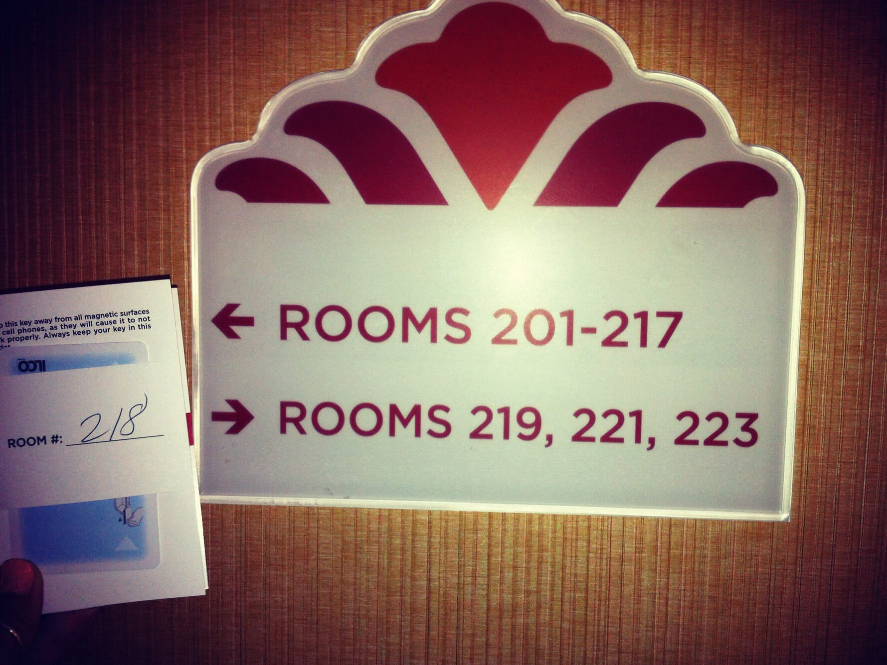
Have you ever faced this signage dilemma? Amazing, isn’t it? I know which way to turn for everyone else’s room but my own.*
And yet, strangely, I have actually had this happen to be more than once. Am I missing something? Or am I less experienced with hotel stays? Do frequent users of hotels navigate better?

-
*Hotel in Alameda California (Note: This is a plaque on a wall, not the door of my room.)
Reading the recent post by my colleague, Lisa Min: “Go Train – An Experience Reviewâ€Â, made me think about whether signage is also tailored to frequent users (let’s call them “locals†for this post) as much as we assume it is for infrequent or new users. One of Lisa’s arguments speaks to the “quiet zones†on the Go Train (a local commuter train in Toronto). Though there is a “quiet sign†posted on certain upper levels of cars, the unobtrusiveness of it almost gives off the sentiment that those that use the Go Train understand the regulations of the train without the need for bold signage. Still…it somehow needs to be posted, since not everyone on the train are said ‘locals’.
Being a Local
Ironically for me, now living in the UK, I feel there is an implied quiet zone in all tight quartered areas (tubes, trains, buses, you name it). And this understanding was immediate for me even before I became what you might call a ‘local’. If no one is talking, I shouldn’t; this is common sense, sign or no sign.
And yet, by personality, I am naturally ridiculously loud and get even louder the more excited I get learning about the things around me.
I have been in London for almost 3 years now and I have to say, I still don’t feel I am a ‘local’. I did proudly discover that the tube doors open where the station plaques are mounted -� that, I was quite excited about (but stayed politely quiet as it was crowded). However, the city is so large and the history so vast that I feel it might take me decades to truly feel ‘local’ and pick up on these more ‘locally’ understood signs.
This was especially apparent when my parents visited me from Toronto (and yes, like me, they love learning and are equally as loud). Walking on the streets of Central London, my parents asked me about the various buildings or where to find such and such a product and I rarely had the answer. However, as we are loud talkers, we discovered that this impelled ‘local’ people to tell us the answer. I have to say, we might have got a bit over-excited about this discovery and subconsciously asked more questions than normal. I remember being on the top level of the 55 bus with my Mom and Dad near St. Paul’s Cathedral and my dad asked me the name of a building nearby. Again, sadly, I did not have the answer. However, the local guy beside us started to laugh and said “this one, I don’t know!†Note: earlier he politely (and without request) gave us the answer to one of my dad’s earlier queries. We all started laughing.
So, this makes me think; there are so many ways that visitors get information about things that are common knowledge to ‘locals’. But how is information portrayed to local or frequent users in a way that they appreciate?
Iconography
One of my favourite topics when teaching Visual Design in our Akendi UX Training is iconography. Icons need to be universal and literal when appealing to a varied population or infrequent users. For example, I was once able to send an iPhone charger from Rio back to my friend in Sao Paolo via airmail simply by looking at icons in the post office (Eu nao fala Portuguese).
This was great! But an icon can also be abstract or metaphoric for those users that are accustomed to your product or brand. For example, thinking abstractly, those that use Google Drive now have learned that the blue, yellow, and green triangle means “Google Driveâ€Â, despite having nothing visually to do with storage. Metaphoric icons often have the “aha…clever†reaction to them when you understand the meaning, making you feel more connected to the concept and subsequently the brand. For example, those that use Twitter might understand and appreciate the association between the bird chirping as a way to communicate information rather than being just a cute icon.
So, if there is room for abstract and metaphoric icons, can we extend this to signage for locals? Can we be more clever and witty depending where we are? The tube signage is only one of many; I hope to learn more and more the longer I live in London.
Please share your experience with ‘local signage’ or suggestions on where we should inspire new ideas, no matter what city you are from, below.
Comments
Related Articles


