Please Let Me Go – The Usability of Flight Booking Systems (Pt. 2)
Exhausted from your exploration of the WestJet flight booking system, you, André Aumond, are looking for smoother sailing and greener pastures with Air Canada.
You hope to find a good deal on travel to see your son’s family in Orlando, Florida. Before you can relax by the beach though, you have to battle online booking systems and so far, it hasn’t exactly been relaxing (Please Let Me Go -? The Usability Of Flight Booking Systems – Pt. 1).
So, with your previous troubles in mind, you head over to aircanada.com to see if things can maybe go a little better this time.
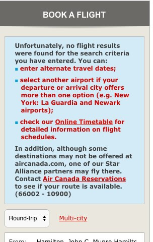
At first, everything seems similar to WestJet. You are asked to provide the same type of information and you enter it in as before. However, you receive no notifications suggesting different airports as you did with Westjet and you wonder if you should try the Hamilton airport again. Wary of the fiasco of last time, you decide to give it a shot. After pressing ‘Search’ you are confronted with a new page.
While this is disappointing, you’re glad that you were at least notified. However, you’re still not sure if this is a route you can fly. Perhaps if you left one day later you’d be able to buy a ticket? You wish Air Canada would just tell you if this is a route or not instead of forcing you to try random dates to see.
Deciding again to give up on Hamilton, you scroll down to re-enter your travel information and are pleased to find that it is all still filled in. After being forced to provide your travel dates to WestJet multiple times, this is a joy to see. All you have to do in replace Hamilton with Toronto, choose Pearson Airport, and hit ‘Search’.
You look at your options and see that you have a couple of direct flights to choose from. As you are considering the different flight options and classes a message pops up.
Quickly you press ‘Extend my session’ and are taken back to the page you were on. Feeling a little more comfortable that you are not just going to be booted back to the main page without warning, you select the cheapest flight and scroll down to get to the return flights. You select another flight and click ‘Continue’.
At the top of this new page you notice a countdown, you wonder if you can still extend your session like last time if the countdown expires. You press ‘Learn More’ to find out, but it doesn’t provide any information about this.
Feeling the pressure of the countdown, you quickly skim through the page, looking to see if you have to pay extra for checked bags. You don’t see any information about this and wonder if it will be on the next few pages or if you already missed it. As the countdown gets lower, you are pleased to see the ‘Extend my session’ prompt again and click it.
You are presented with an offer to buy a discount food voucher or travel assistance. You decide to skip these two options and click ‘Next’. You are asked to input your Aeroplan details on the next page or continue if you don’t have them. You have never been an Aeroplan member, but you were thinking of signing up. You scan the page for an option to do so and don’t see anything helpful. Hoping that maybe you’ll be prompted on the next page, you hit ‘Continue’.
You don’t see any option to become an Aeroplan member, but you do see this message in the corner of the screen.
You decide just to continue with the booking process and sign up later then. As you start to fill in the passenger information form you are pleased with a few improvements from the Westjet system.
The list for titles has now gotten rather unwieldy, but you are actually able to select the title of Dr. You’d still prefer if this field was optional, but it is an improvement.
You no longer have to wonder about how to type in your first name, the system will accept you typing é.
And you finally know why the airline cares to ask your gender.
Seat reservation with Air Canada still costs money as it did with Westjet, but you like that a prompt has been provided to try to get the type of seat you want without having to pay. You check off ‘Window’, hoping that you’ll have the opportunity to watch the clouds and scroll to the bottom of the page.
You finish filling in all your information and click to go to the next page. On the next page, you now need to enter your payment information. You pause at this step. You still haven’t noticed any information about baggage fees, and are very hesitant to book a ticket before you find that out. You can’t see any way to go back from here, so, with reluctance, you press the ‘Home’ button.
While you don’t want to be going through the entire process again to see if you missed something, you are at least glad that you didn’t have to retype your flight information into the search boxes on the homepage. You press ‘Search’ and are taken to the flight selection page. It is this time that you notice that there was a tiny message at the top discussing baggage fees. There was so much going on when you got to this page that you didn’t notice it the first time.
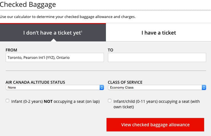
You click the link to get to the checked baggage page to find out how much your fee will actually be. Instead of being presented with a number, you are given a search system.
You type in the information, thinking that this is all very silly as they already know where you are going and what class you are in. It seems to you like they just should have provided a figure during the booking process like WestJet did.
After submitting the form you are finally presented with your baggage costs. You can now factor the additional cost into your total flight cost and you decide to proceed with booking these tickets.
The process with Air Canada was far smoother than with WestJet, but Air Canada still has some work to do to make flying a breeze.
There are two major areas that Air Canada could work on in their booking process to improve their user experience.
Anything you don’t need: don’t ask it.
Try to keep your steps down to a minimum by reducing the amount of information you ask for. Completing your form shouldn’t leave your users feeling like they’ve just finished a three-hour exam. You want people to get to the end and make their purchase so do everything you can to help them get there. This means using the information you already have and eliminating the information you don’t need.
Make your total costs clear.
Flights are expensive; this is usually a pretty major purchase for many people. Having the flight cost be highly visible will make help users complete their purchases more readily and easily. Don’t hide the baggage fees in the fine print; make them explicitly stated in the fees section. In fact, take it one step further, allow people to buy their checked baggage when they book their ticket. Separating part of your airplane purchase from the booking process seems strange at best and rather annoying at worst.
It was a long journey to get this far and you haven’t even left your house yet, but the beach is calling, and you’re finally ready to go.
Comments
Related Articles


