I Don’t Want Your #&%$!@* App
Claiming to be the front page of the internet, Reddit is one of the most visited websites in the world. In the past three months, there has been a strong push to get users to move to the mobile app. Without going into a detailed comparison of either experience, there are areas where the app excels (creating a post) and other areas where the mobile website is better (readability). Regardless, what has caught my attention is the overuse of dark patterns.
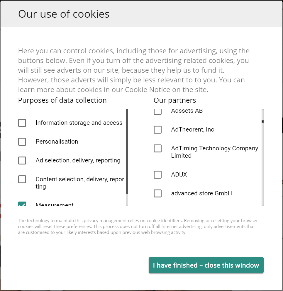
Patterns are reusable, validated templates that designers can use to speed up and clearly communicate the design. Dark patterns are tricks in the design that run counter to the goals of the user and are used primarily to achieve a business goal. For example, when checking out, if the system defaults an option so that you are automatically enrolled for additional insurance unless you opt out, that is considered a dark pattern. Making you provide the email addresses of your friends and family in order to get your quiz results, is another example of a dark pattern. One outstanding example of a dark pattern is provided by the Guardian website. When users opt out of allowing the site to place cookies, users must deselect “individually”every instance for which that cookie might be used. As you can see from figure 1, below, the size and location of the scrollbar for the list on the right indicates that there are likely hundreds of options, presented in a very small and difficult to navigate window. To make this user-friendly, there would be an option to deselect all the items on the list, but instead, the user is forced into a labour-intensive task that many will likely abandon.

In the case of Reddit, the purpose of the dark pattern I observed is not as nefarious as the example, above, however, as a user, I still found it frustrating. I observed the pattern while attempting to read an article on the Reddit site from my mobile phone but the barrage of buttons and notices pressing me to “use the app” made that simple task very difficult.
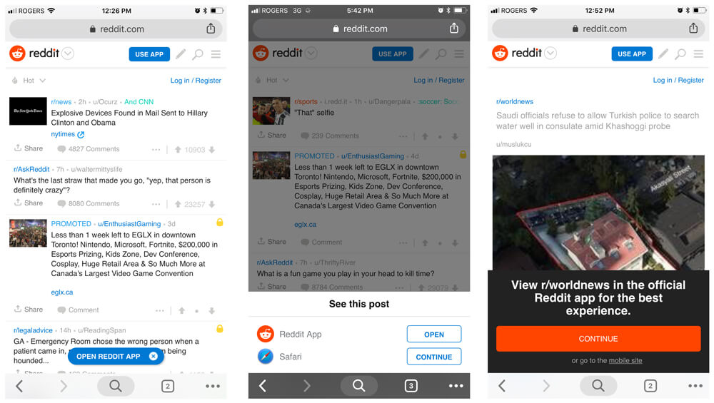
From the landing (home) page (figure 2), I am presented with two buttons that persist as I scroll up and down. The floating, blue button on the bottom often blocks access to the content behind it. Furthermore, when I reached the bottom of the screen, the proximity of the “Open Reddit App” button to the “Next” bottom, resulted in my accidentally jumping out of the browser. After selecting an article from the list (figure 3), I was presented with the option to view the content in the app or continue within the browser. The position of this messaging is yet another opportunity for proximity to cause misclicks. Finally, once I selected an article (figure 4), I was presented with a third prompt to open up the app. However, this time, I needed to pay close attention to the fine print below the excessively large “continue” button, in order to reach the mobile site. Another ‘trick’ I found particularly interesting here was the switch in the use of language between the screens in figures 3 and 4. In figure 3, I selected “Continue” to avoid the app, but in figure 4, the action associated with “Continue” changed to direct me to the app.

When working with our clients, we often have to discuss the business requirements and user requirements and identify the areas where they conflict. When there are conflicts, business requirements will often trump user requirements. While this is understandable, we work hard to ask whether there is any flexibility by the business to reduce the impact on the user and to create a solution that is a win for both the business and the users. In the Reddit example, asking user four different times – in increasingly more obtuse and complex manners – to download the app shows me there was little negotiation between the business and user requirements which resulted in what I felt is an inconsiderate user experience.
Comments
Related Articles


Quora recently had a very similar experience. Very frustrating! …
Also, while writing this comment I got the “Time limit is exhausted. Please reload the CAPTCHA” error message displayed invisibly in very light blue text on the white background, while I was doing the math: [?] x seven = 56… 🙁 Assuming I know what a “CAPTCHA” is and how to reload it. I hope I can answer: eight – seven = [?] faster!?
Hi Ilona,
Thank you for your comment! We’re sorry to hear that you’re experiencing problems when commenting on our blog. We’re currently working on fixing this issue, and we hope you continue to read and participate in the future.
Cheers
I hated Reddit when it came up on my phone. Will never use it again.