Is Pretty Food Good Food?
A few months ago, a colleague of mine told me Uber was going to start a delivery service: UberEats. We were excited. As soon as the app became available in Ottawa, we placed our first order for our Akendi Friday Lunch. We browsed the clean, simple webpage with fantastic pictures of various restaurants in the area.

We finally settled on a restaurant and I clicked my cart to place the order.

First, I needed to create an account and sign in or register, which I expected based on my experience with Uber’s ride service. Next, it asked me to enter a credit card. I tried many times but to no avail. UberEats did not like my company credit card. I should have given up, but I was too stubborn. I signed into my personal Uber account, and started the process over again. I thought I could simply add the company card to my account. So I made my way to account settings.

I played Where is Waldo and finally located the “Add a Payment Method†symbol. Did you find Waldo? He’s the tiny plus symbol on the far right of the page. My eyes were focused on the content on the left so it took me a while to find it. Nevertheless, I was appeased and clicked the symbol.

The error message that followed was maddening! I had to use the mobile app to add a different card to my account. The coolness factor of using my phone’s camera to take a picture and record my card’s number did not offset my growing ‘hangriness’. In addition, I still had to manually enter the CVV number and expiry date. After waiting and finally seeing that the card was added to the app, I turned back to my desktop hoping to see my credit card. Nothing.
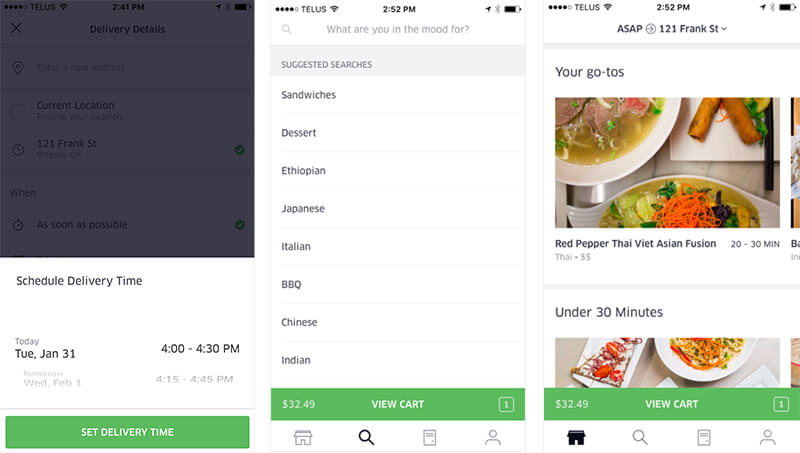
At this point, I was frustrated and would have abandoned for the second time, but the pretty pictures of delicious food we had already selected called to me. I carried on with my mobile phone and restarted the order. Again. I noticed options that I did not see on the desktop site, like scheduling a time for delivery, a search for specific types of food and additional categories like “Your go-to’s.â€Â

Typically, Mobile apps and sites will have some discrepancy in features and content when compared to their desktop counterparts. This is due to screen real estate and a difference in tasks performed on each platform. In this case, however, I struggled to understand why I would want to schedule a delivery time on my phone but not on my desktop, why I wouldn’t want to search specifically for pizza, and why I wouldn’t want to see fun categories like “Your go-to’s.†My best guess is that UberEats was designed as an app for mobile, therefore less time and money was allotted to redesigning all their features for the desktop version.
I digress. Back to my order: I finally tapped “ORDER†and it looked like I was good to go. Just like Uber for rides, a map with pins appeared and I could track my order. I was concerned about the amount of time the food would take to be delivered because there was no indication prior to placing the order. I actually looked up and called the restaurant to make sure they could accommodate a tight timeline.

Once the order was placed, a clock estimating the time of arrival appeared. Perfect. It would arrive on time…or so I thought. I watched in horror as the clock added 5 minutes, 10 more minutes, 30 more minutes to the delivery time. My order placed at 11:33, originally estimated at 12:09 pm arrived at 12:35 pm. I also had another chat with the order taker from the restaurant who assured me the driver was on his way.

I felt compelled to express my dissatisfaction with Uber’s service so I perused their site. Nothing in their FAQ about “What do I do if Uber’s food delivery is chronically late and I have to wait twice as long as predicted to get my food and still be obliged to pay a $5 delivery fee?â€Â
This service fiasco is not the restaurant’s fault. In fact, the food is quite good and Uber often selects interesting and high-quality eateries. However, the sign-up process, adding a payment card, and the lack of features on desktop make the experience not only frustrating but also almost impossible. Since my first disappointing experience with UberEats, I have used their app (both on desktop and mobile) quite a few times. Each was met with dissatisfaction and extreme hangriness. So why do I keep using it? Because the pretty pictures and clean interface draw me in and I forget that I waited an hour for my food. I convince myself this time will be different and those other times were small hiccups. This is the reason we stick to things that don’t work optimally, cause us grief, and ultimately do not suit our needs.
Like a bad, unhealthy relationship, we cling to systems, products, and services we like or trust for illogical reasons. Sometimes aesthetic and smoothness is valued higher or has a greater impact on our sense of trust than functionality. This keeps us coming back again and again, regardless of constant dissatisfaction. As for UberEats, I’m going to finally remove temptation and delete the app, no matter how pretty the pictures or how pleasing the motion design. I’ll stick to Skip The Dishes or go old school and call the restaurant.
Comments
Related Articles


