< Back


Who Are You and What is Your Story?
Every website should tell a story in some form or another. Its design should reflect who you are and what you want to tell your users.
Your story can be very literal or metaphorical, it all depends on what you have to say. People naturally communicate by telling stories and the ways in which we communicate information should be no different for digital spaces. Visual storytelling communicates on a more human level, ignites greater engagement and creates more excitement about whatever you are creating among your viewers. Here are a few examples of interesting websites of all types that have utilized story telling successfully to represent who and what they are.
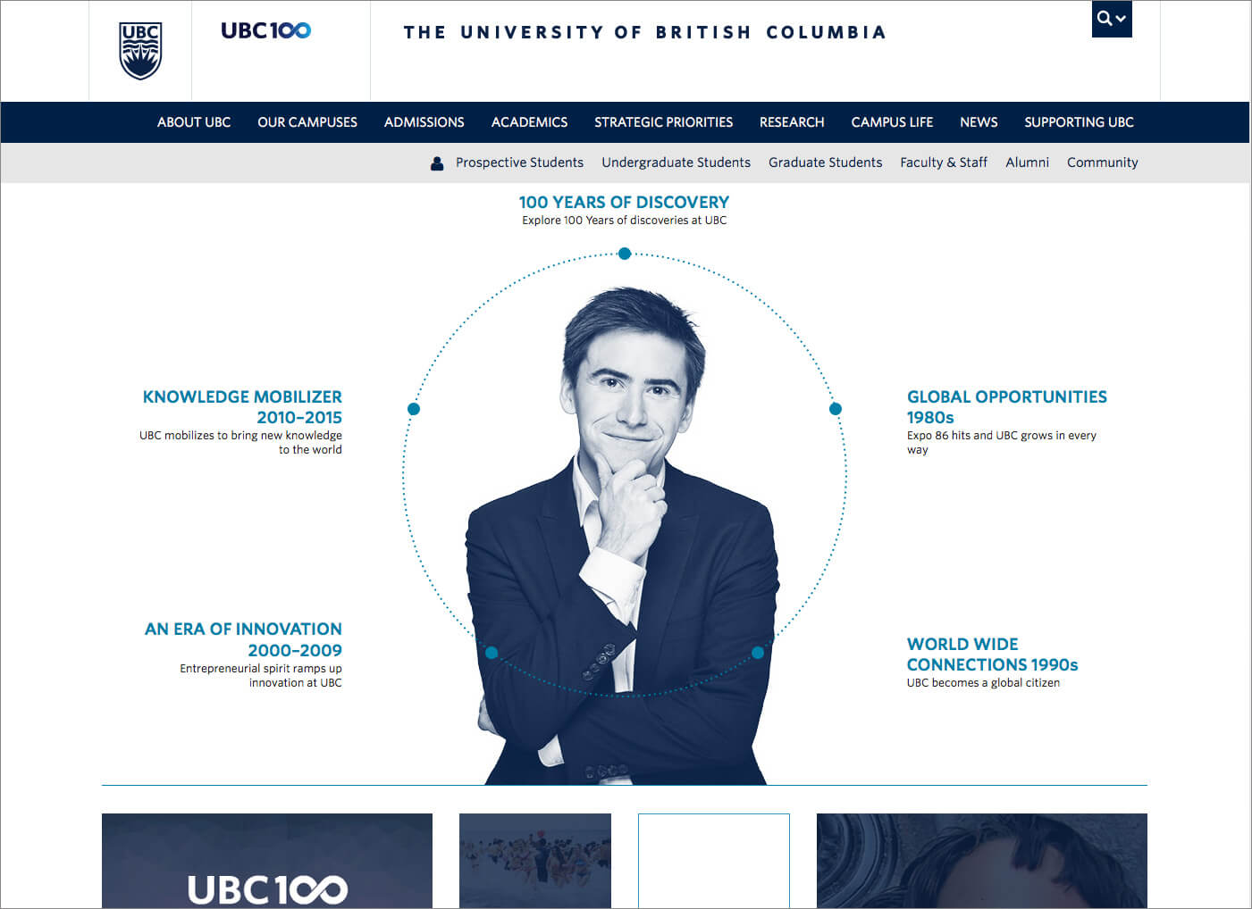
University of British ColumbiaÂÂ
UBC’s website pulls the user in at every chance they get. Focusing its story on its community and history gives the user the impression of a welcoming and inspiring place to learn. The visual design of every page is fresh and friendly, showcasing huge beautiful images and bold type further embodying the aspirational feeling of the site.  Furthermore, UBC’s website is highly useful and usable. They’ve done a great job at integrating the narrative while also making their site easy to navigate and find information. Given that there is so much content on their site, this must have been no easy task. UBC is one of the best examples of an educational website I have seen because it is equally beautiful, usable and engaging.
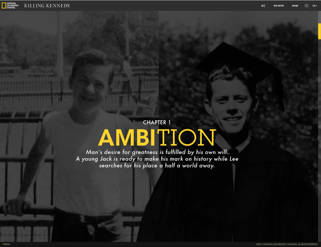
National Geographic’s Killing Kennedy
This website takes storytelling quite literally. Designed as a comparative timeline of JFK and Lee Harvey Oswald’s lives leading up to JFK’s ultimate demise, the site acts as a promotional website for the movie Killing Kennedy. It’s a creative and highly informative look at these two characters’ lives drawing the user deeper into their story and sparking interest in wanting to learn more. What makes this website interesting are the various mediums they’ve used, a blend of web, film and magazine. This website’s endless downward scrolling through the lives of two men feels like flipping through a national geographic cover story, mixed with motion and real film creating a rich, surreal and highly engaging web experience. This is one you could get lost in for at least an hour, discovering the story of Kennedy and Oswald.
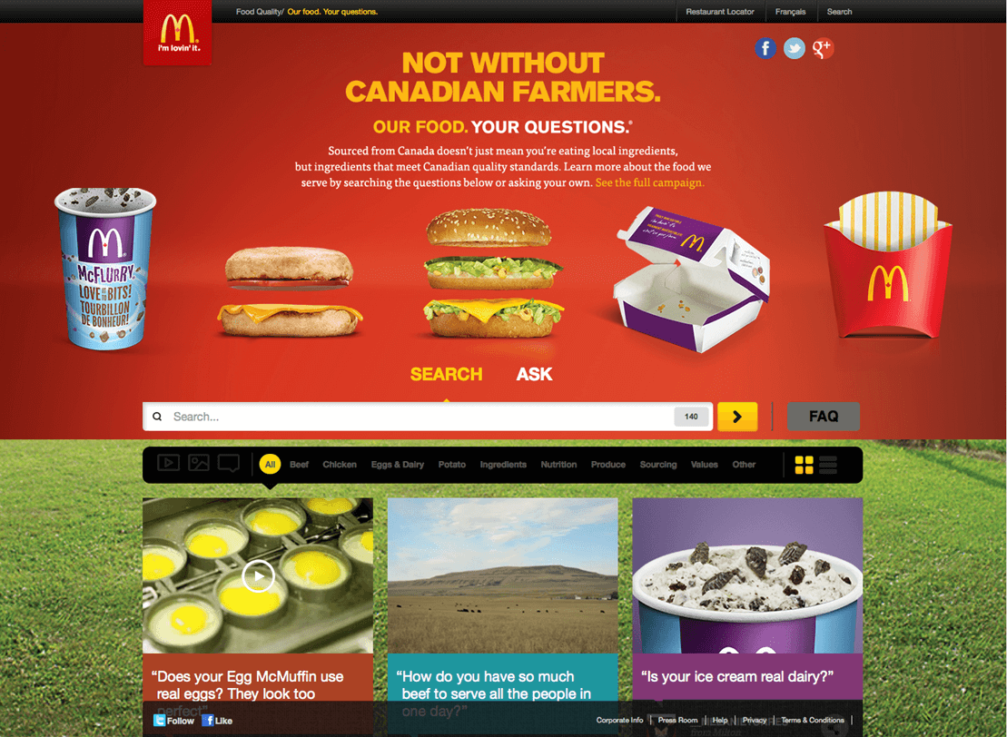
Your Questions McDonald’sÂÂ
A website with a very specific purpose. “Ask us anything” – What a clever and rather daring idea for a company with a growing negative public image. This website by McDonald’s does a great job at bringing their business back to their customers and debunking McDonald’s myths. Using a highly photographic approach, McDonald’s puts the faces of their farmers, employees and animals front and center of the user’s attention creating an emotional connection challenging what they think they know about McDonald’s. This website has taken advantage of the power of social media opening up a global conversation about what the McDonald’s brand really is. A combination of community outreach, marketing, photography and design created a positive buzz for McDonald’s when it was released. With a message that says we are not perfect but we are honest and so is our product “your food. your questionsâ€Â.
Next time you create a website ask yourself, what’s my story and how do we tell it?

Share this article


Comments
Related Articles