< Back


When designing for Persuasion competes with usability: A look at the Amazon Experience
Making technology more usable is generally thought to add to its persuasive capability, but are there times when usability goals conflict with persuasion goals? Amazon.com is a well known site that is often used as an example of good persuasive design.
This post walks through an Amazon experience to explore how usability and persuasion interact.
Ask around at your office, your gym, your book club even (okay maybe book club is a bad example) to see who has never used Amazon? My guess is probably not many. If not for purchase, many users of the site flock there to review and compare products.
Amazon has many tactics to hook users in. Free shipping – just buy more items. Get it tomorrow – order in the next 6 hours and 33 minutes! And of course, the item is always on sale to boot.

-
The Amazon product page with many hooks to draw you in
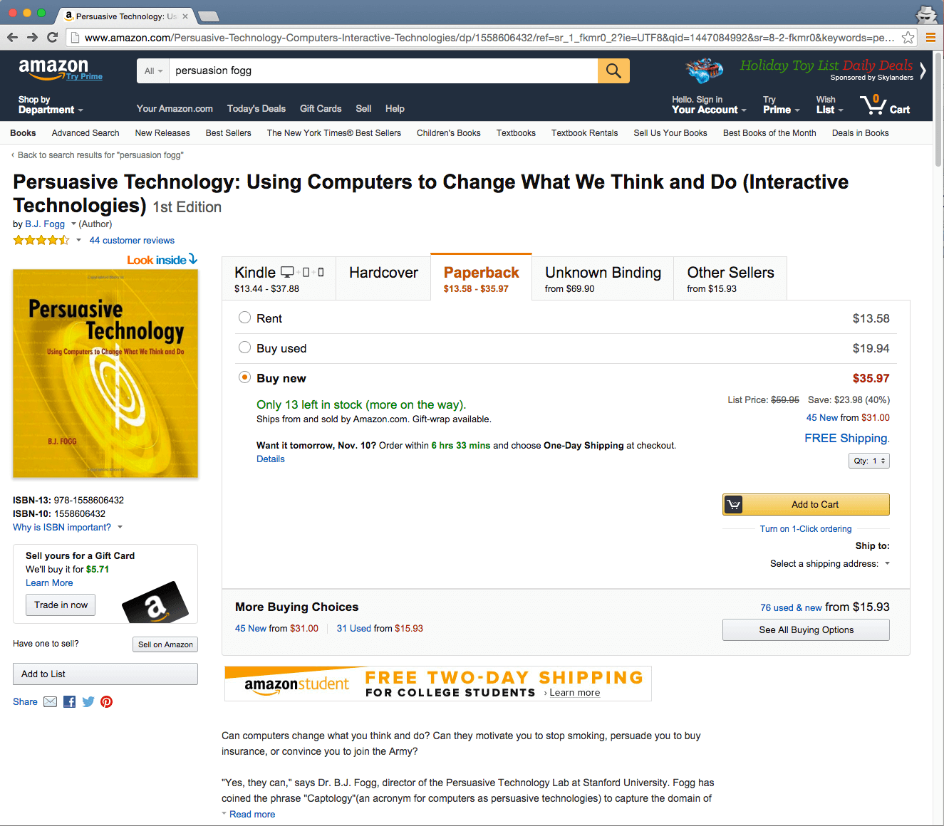
Even if you just want to see reviews, you have to scroll down past all those great pictures of what other users have bought after looking at the same item you are looking at. Don’t get me wrong – I love all of the options and features that Amazon provides. I’m just saying the site has been designed intentionally to persuade you to make a purchase, and then ultimately to purchase more.
There is no doubt that there are a lot of elements on an Amazon product page that can take away from a user’s focus. Perhaps I can also point out that forcing a user to scroll down to the bottom of the page and clicking one extra time to see the newest review or even the product description is not efficient. But in these cases, persuasion outweighs usability, and truth be told they are not huge usability crimes.
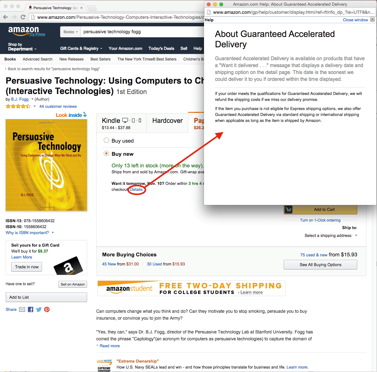
However, let’s say I just want to find out how much shipping will cost so that I can actually get the item tomorrow. Hmm… click on the details link beside the “Want it tomorrow…†message? Nope, that’s just a pop-up telling me that accelerated delivery is available on this product.

-
No obvious method of finding out the shipping cost
I quickly scan the page, but the only real option I see is to put the item in my cart.  My mental model of how this usually works tells me that I may have to enter in my address to get an accurate shipping cost. Let’s see how this goes.
Step 1: Add to Cart
Step 2: Proceed to Checkout
Step 3: Sign In or Create an Account
-
The user has to sign in or create an account before shipping costs are shown
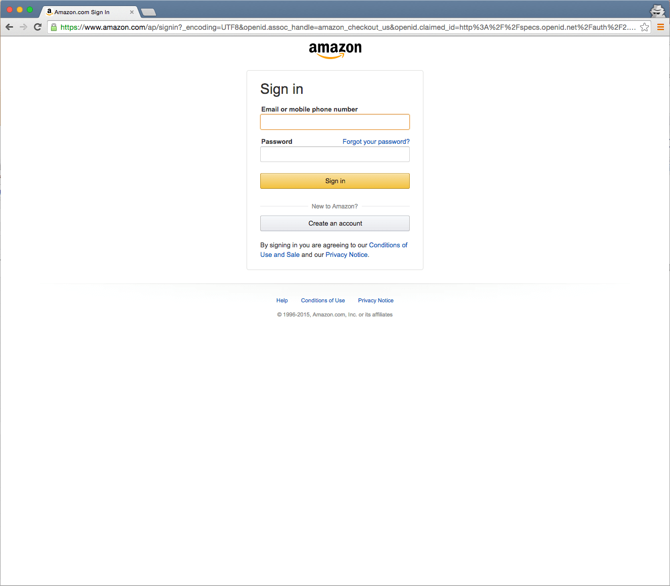
Wait a minute, there is no guest option? If this was any other site, I would quit at this point; I don’t want to sign in or create an account just to see shipping costs!  I decide to proceed because I already have an Amazon account. I really want to know the shipping cost and I guess a big factor is trust (another key element of persuasive design). I will (reluctantly) go through the necessary extra steps to find that shipping cost because I believe Amazon is fairly trustworthy.
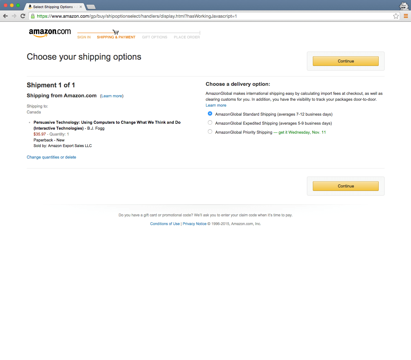
Step 4: Select a Shipping Address. That’s fair, perhaps they need that information to actually calculate the shipping. Although couldn’t postal code have sufficed on the product page?
Step 5: Choose your shipping options. Ahh finally… shipping options.
As I look closely, I’m presented with three shipping options but the price of these options doesn’t show up anywhere! Now I’m frustrated. I don’t really want to select a shipping option before seeing the cost of that option.  Sigh… Continue.
-
The shipping option selection screen shows up without displaying any costs
Step 6: Select a payment method. Seriously??? I have to enter in my credit card information before I see the final cost!!! Oh Amazon -� why?
- Payment information is required before the total cost is shown
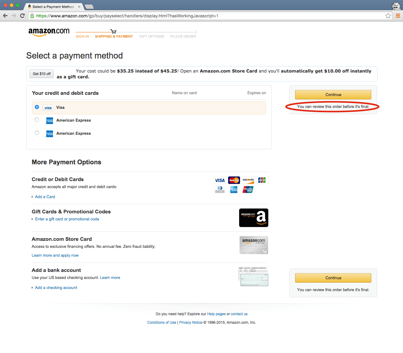
Conveniently my credit card information has been saved (another persuasive technique), so all I have to do is press continue. I’m already this far, and the next step should surely break down the shipping costs for me. Besides, Amazon assures me that I still have time to “review this order before it is finalâ€Â.
Step 7: Review your order. Alas, on the last page I can see the shipping costs. Even better, I can select different shipping options and the price automatically updates.  So they do know what users want, but they have ensured that I sign in and provide my payment information before telling me what I want to know. All I would have to do now is Place My Order. One click and the order is complete.
-
 The final step in the process shows shipping costs but there is no option to cancel your order
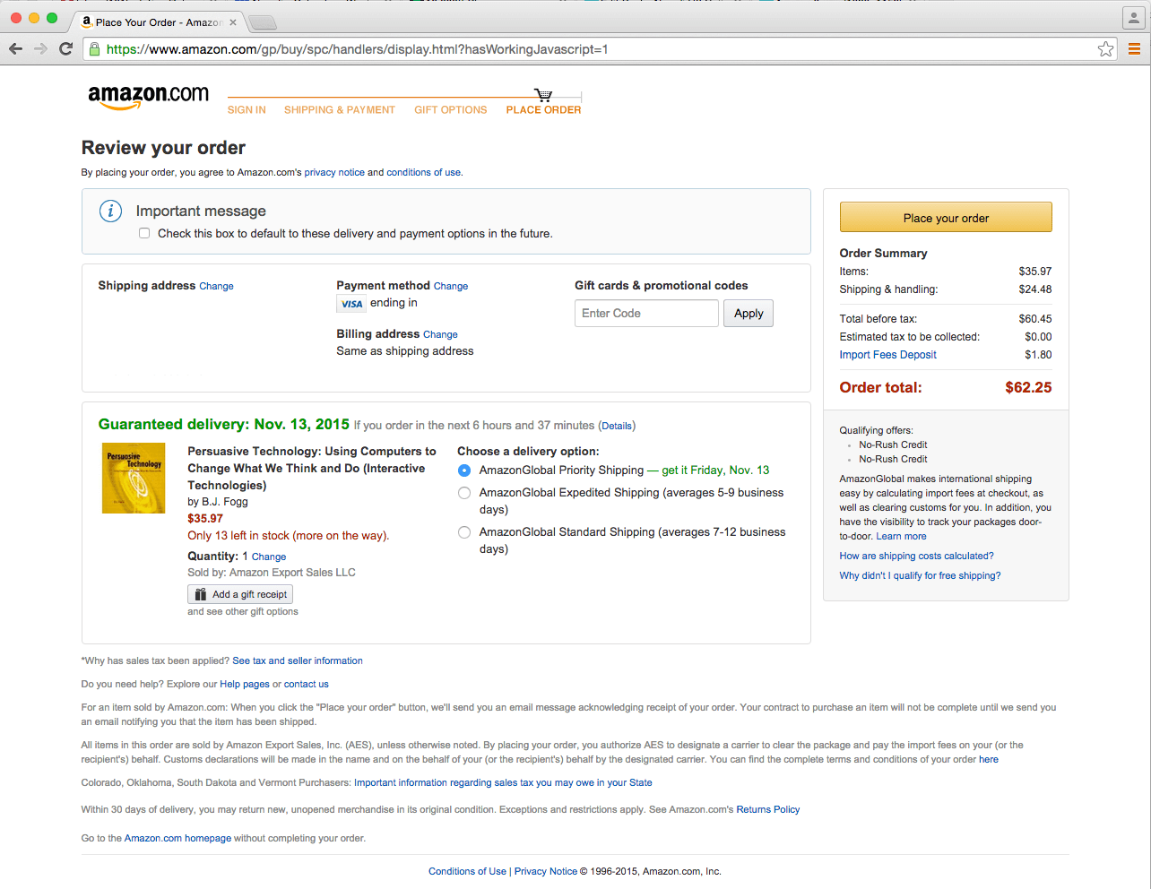
But wait… I don’t actually want to purchase the item yet. I just wanted to find out the various shipping costs. So how do I get out of here without making the purchase?
Cancel button anywhere? No. Maybe in the fine print? No? Back button anywhere? No. Maybe if I click on the global icon for home -� the page logo that says amazon.com? Nope.  I can’t even click on any of the steps at the top to get back.
The only way I can exit this page is by closing the browser window or using the browser back buttons.
Step 8: Close the browser window! (And then go back and make sure my order did get cancelled because of course there is no feedback).
If we’re looking at usability, then determining the expedited shipping cost was very low on the effectiveness, efficiency and satisfaction scales. I finally achieved what I wanted to achieve, but felt annoyed and frustrated that I was forced to go through eight steps and get to one click short of purchasing the item before I found the information I wanted.
One click away from ordering is Amazon’s goal. Although I’ve never tried it, I’m sure turning on 1-click ordering would make the ordering process more user-friendly. It would definitely be effective, efficient and satisfying. And perhaps users would be more likely to make the purchase. It’s a goal where usability and persuasion align. As long as that is what the user wants to do.
On the other hand, being forced through a seemingly unnecessary flow in order to find the answer to a pretty standard online shopping question and then giving the user no discernable method of cancelling or exiting feels a bit like being cornered at the end of a vacation timeshare sales pitch.
Persuasion gone too far?  Perhaps. One thing is for sure, it is definitely a case where usability has been sacrificed.

Share this article


Comments
Related Articles