< Back


The Toronto Police Car Design Dilemma
It’s never as simple as just changing the colour
A little while back there was a bit of controversy over the decision by the Toronto police to change the design of the police cars. The police chief wanted the fleet to look more “modern and sleekâ€Â. So the colours were changed from white with red and blue strips, as shown in the first image below figure 1A, to dark grey with reflective strips, which appears as either white or dark grey depending on lighting conditions, as shown in the second image figure 1B.
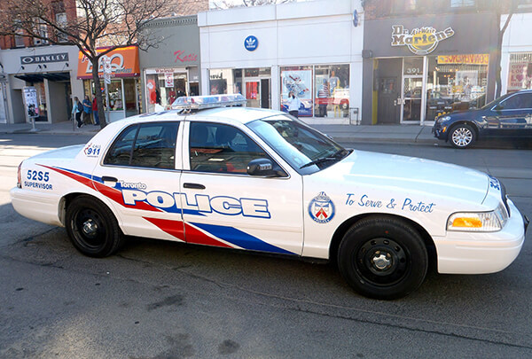
Figure 1A: Current/old police cars | image source: Wikimedia Commons
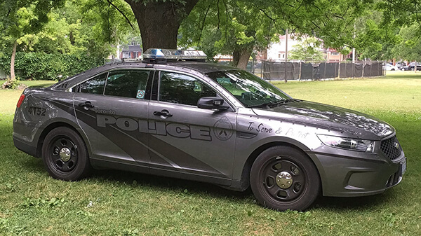
Figure 1B: Proposed new cars | image source: Reddit
The last time police cars had changed in colour was in 1986, when, after long debate and research, the Police Services Board decided to switch from yellow to white. The goal was to increase the visibility of the police in the community and research, at the time, had shown that white cars were more visible.
This time, the decision to change the police colours was made on the whim without public consultation or consideration of the design. The selection of the design is more than just picking colours; the decision impacts how the police present themselves to the community and the functionality of the vehicle.
The colours are just one part of the police brand, but it affects how the community perceives and reacts to the presence of the police. The police chief may have wanted to make the vehicles feel more “modern†or “sleekâ€Â, but the selected colour scheme can also be interpreted as authoritative, which are not positive attributes. The previous colour scheme of white with red and blue strips sent a very different message. White is typically associated with innocence, cleanliness, freshness, blue is associated with trust or loyalty, and red is energy or danger. All are values that are expected from the police. More consideration should have been given to how the police want to be perceived by the community.
Next, colour selection has a critical role in the performance of the vehicle, and the decision will be influenced by the requirements set by the police. If the goal is to increase the visibility of police then there is a great deal of research that has found ways to maximize visibility. First, use of fluorescent green or orange is highly visible in night and daytime conditions, regardless of the season. Next, the use of the Battenburg marking on the side of vehicles increases vehicle visibility. Both examples are used by emergency vehicles throughout Europe, as shown in Figure 2. The British police car may not be visually appealing, but it serves its’ purpose.
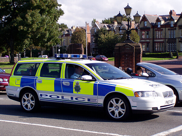
Figure 2: British police vehicle | image source: Wikimedia Commons
Which raises the concern that perhaps the Toronto police were not looking to increase their visibility, but instead intended to conceal themselves. The grey colour scheme is very similar to the current colours used by unmarked police vehicles, shown in Figure 3. First, this sends the message that the police want to secretly monitor our behaviour. But more importantly, it puts the officers’ lives at risk. A dark police vehicle that is pulled over to the side of the road at night is more difficult to detect by passing traffic. An officer that pulls someone over for a traffic stop increases the risk of being hit.
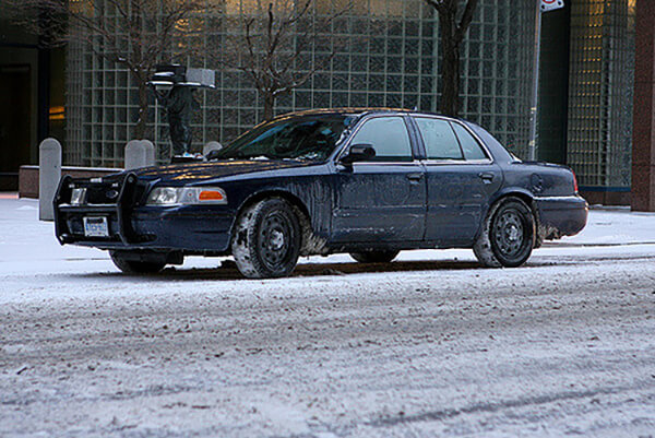
Figure 3: Unmarked police car | image source: Flickr
In response to the controversy, the police decided to launch a survey to get public consultation on the design of the new cruiser. However, this time they went too far in seeking public consultation. In the survey respondents were asked to provide input on each individual element of the car design. For example, the participant was presented with different styles of strips of on the side, and different positioning of the text (“Police†and “To Serve & Protectâ€Â). While I applaud efforts to get public feedback, I would never expect members of the public to design the vehicle. A better approach would be to get input on the visual language, and an option to select a preferred design from a small set of concepts.
The general public are not designers, and design by committee doesn’t work. Perhaps next time the police will engage the services of the outstanding design community in Toronto.
Update
Since this article was originally written the Toronto Police Service released an image of their new car design, shown in Figure 4, based on the feedback from the public survey. The grey colour still dominates the vehicle, but they’ve changed the doors to white, to add contrast and visually distinguish the police car from a civilian vehicle. The continued absence of the Battenburg pattern means no consideration was given to increase the visibility or make the car less inconspicuous. In addition, there are black dots along the edges of the hood which appear to have no purpose. The dots may be reflective, but they would be too small to be noticeable.
The revised design gives the appearance of addressing concerns without making a serious effort to correctly go through a thoughtful and rigorous design process.
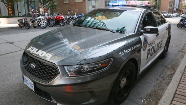
Figure 4: Revised police car design | Image source: CBC

Share this article


Comments
Related Articles