< Back


Hawaiian Missile Crisis: A Result From Design Error Not Human Error
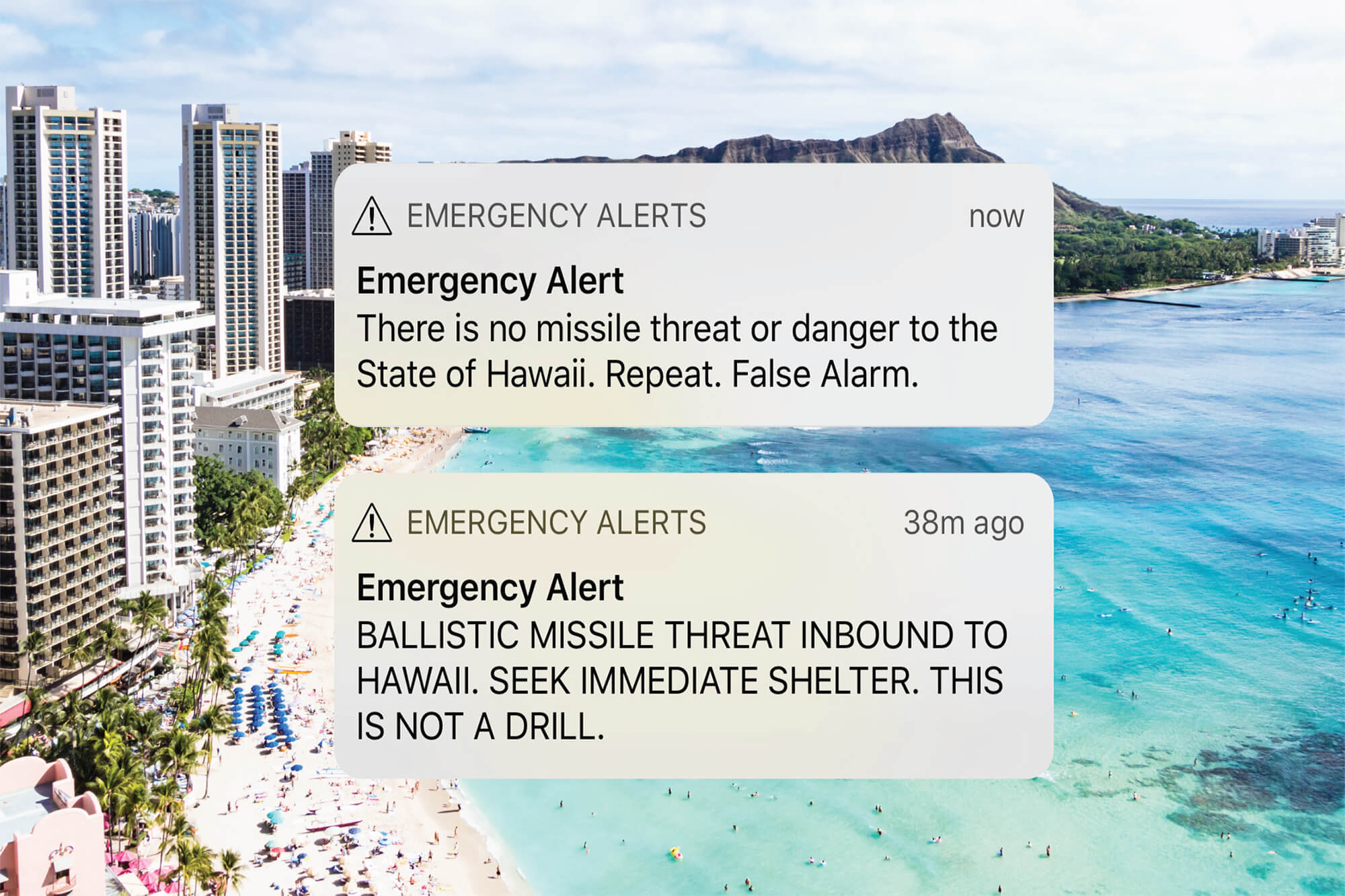
After 40 panic-inducing minutes on Saturday, January 13th, when residents of Hawaii believed that missiles were on the way, the message that the alert was a false alarm was finally broadcasted and life returned to its normal pace. In the moments that followed, government officials were quick to blame “human error†for the false alarm.
As the incident investigation gets completed there will be additional insights into what happened, but the initial evidence suggests that what happened is not due to human error, but design error.
Previous blog posts have explored the topic of human error and the different types of error and it’s too early to determine that exact type of error that occurred here, but whenever you hear about “human error†in a news story, you should swap out the word “human†with the word “designâ€Â, unless the user behaviour is intentionally malicious.
My initial expectation of how the error was made was based on the assumption that the user was presented two buttons, one labelled “Test Alert†and one labelled “Launch Alertâ€Â, and pressed the wrong button. The Washington Post article (note: link to goes an article behind a paywall, use Incognito mode on your browser to view) on the incident suggests the error was much easier to be made than a simple miss click:
Around 8:05 a.m., the Hawaii emergency employee initiated the internal test, according to a timeline released by the state. From a drop-down menu on a computer program, he saw two options: “Test missile alert†and “Missile alert.†He was supposed to choose the former; as much of the world now knows, he chose the latter, an initiation of a real-life missile alert.
It was a drop-down list! The user had to choose an action from a drop-down list, which is probably the worse design pattern that could be used for selecting a user action.
Context is Everything
Without knowing the context on how the drop-down control is designed, I can’t speak to the specific issues with how it is used in this scenario, but there are well-documented usability issues with drop-downs:
First, a drop-down may not reveal all the items in the list without scrolling and depending on how the items in the list are organized; lets’ assume alphabetically, the user would see the “Missile Alert†option and not the “Test Missile Alert†option.
Second, drop-downs can be sensitive to unintended user actions. Let’s assume that the user is accessing the system from a pretty common setup in a government office, a desktop with a keyboard and mouse that has a scroll wheel. If the drop-down has focus, the user may accidentally hit the scroll wheel and change the selected value without being aware that they did.
Third, the options in a drop-down are presented as equal; there is nothing that visually differentiates the outcome of selecting different options. However, there is clearly a big difference between testing an alert and sending an alert. That is why we design big, red buttons, to visually communicate the seriousness of pressing one button versus the other.
Lack of Constraints
In addition to the poorly selected design pattern, the second design issue is the lack of constraints. Whenever we are about to delete something, the user is prompted for confirmation. At that moment, the user is presented with the possible outcomes of completing the action and has a chance to pause, reconsider, and backtrack if necessary. It’s not clear from the story that the user needed to confirm their decision, and if the outcome of the decision was obvious.
Finally, if the user makes a bad decision, they should be able to recover. However, the alert system was designed to be irreversible. So once the alert was sent, there was no way to send out a false alarm message, which is why it took 40 minutes for the truth to be communicated.
According to new sources, the user that made the error has been reassigned jobs, but ultimately the question is: How will the poorly designed system be addressed? It’s easy to blame the human, but if the system design is not addressed the error will occur again.

Share this article


Comments
Related Articles