3 Real-Life Examples of Simple UX Design Solutions
It’s easy to call out bad design – there’s a lot of it.
But finding and appreciating examples of good design can feel challenging. We encounter good designs every day, yet they’re easier to miss because they work. Such designs are well-thought-out simple design solutions that make everyday tasks enjoyable.
Here are three examples of simple design solutions where you’d least expect it:
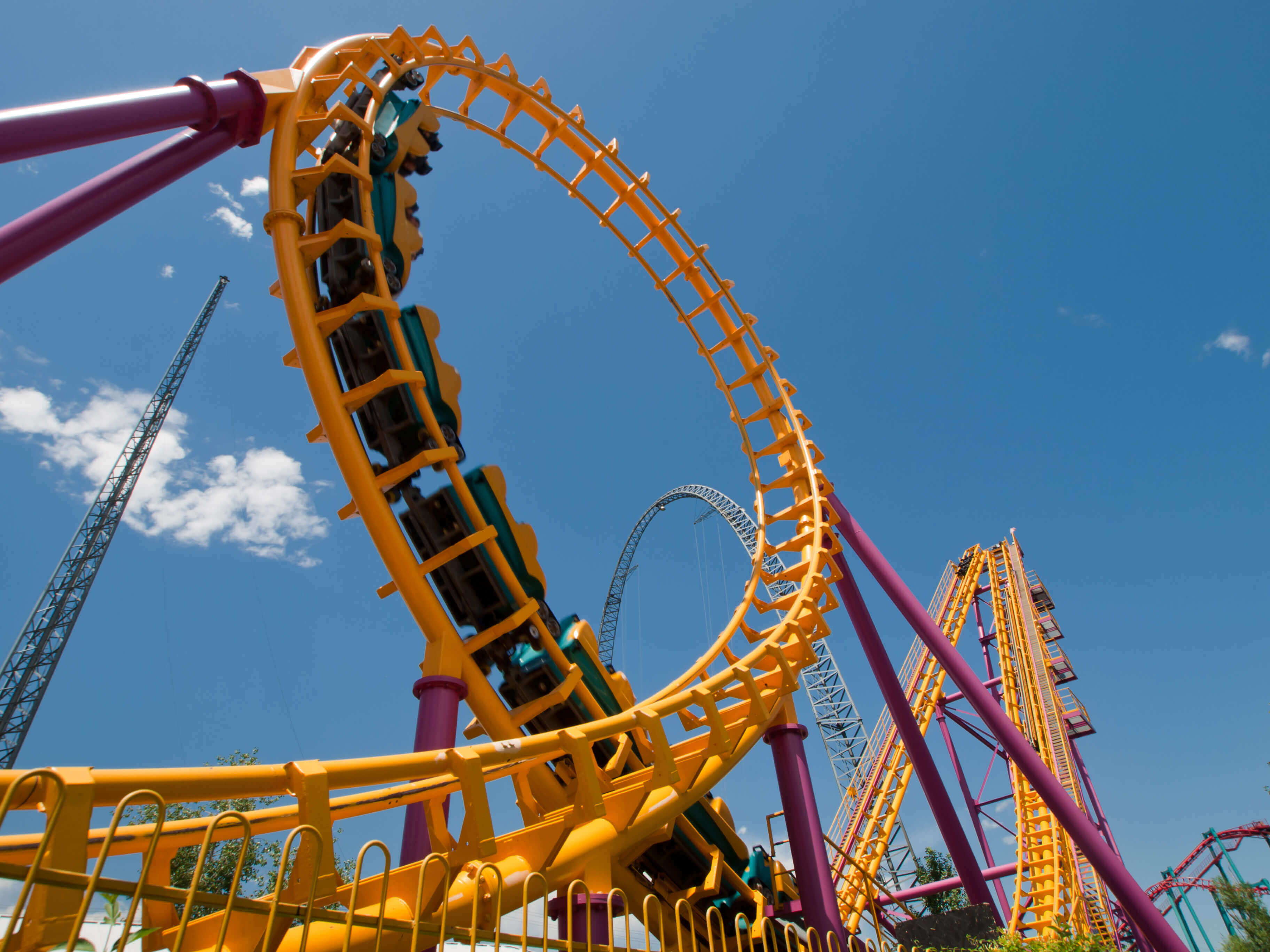
1. BrightGuard Sunscreen Dispensers
The cheery yellow dispensers along Toronto’s Waterfront Trail remind people to wear sunscreen. While slathering on blobs of it is already a good idea, an even better one was including a mirror as part of the design.
brightguard.com
It’s evident that the process of applying sunscreen influenced the dispenser’s design. Have you ever tried applying sunscreen to your face without using a mirror or the help of another person? It’s pretty difficult to cover all areas, which often leads to blotchy white patches (and embarrassment!) The mirror gives more reason to use the dispenser, ensuring that you’re all covered.
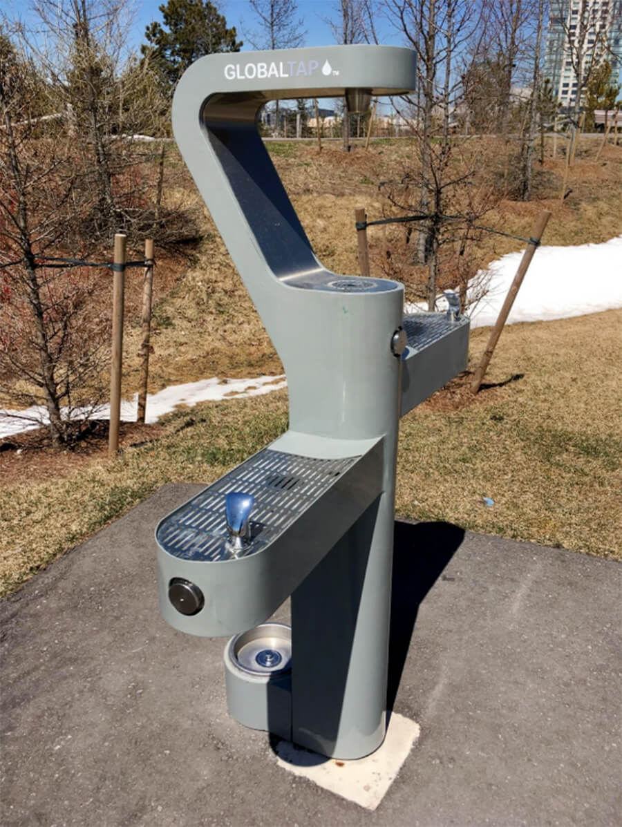
2. GLOBALTAP TAP Stations
GLOBALTAP’s TAP Stations in Trillium Park are a great example of product design.
Instead of a single tap, there are four taps all with their own unique purpose. Two of these taps are for drinking, both at different heights. One is for filling up bottles, and at the bottom is a bowl dedicated to our furry friends (dogs get thirsty too.)
Other elements of the park and people’s experiences there are also considered. Bike posts are nearby seating areas so cyclists wanting to take a break can rest and take in the scenery. They can lock their bikes to them, or for the less paranoid, lean their bike against it.
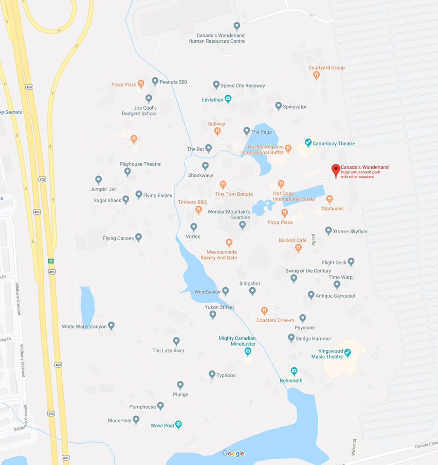
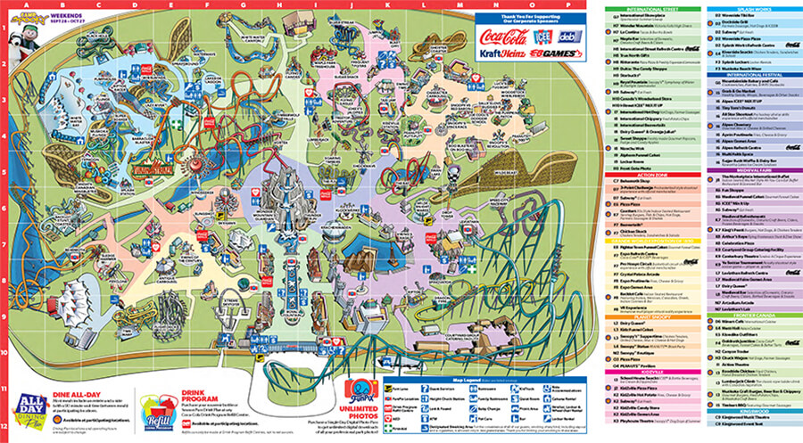
3. Canada’s Wonderland Map
Maps have set conventions to them, which don’t always make sense in all circumstances. Maps are formulaic: the top is north, there are a ton of roads and trails, and text labels any important landmarks.
Take a look at amusement park Canada’s Wonderland in typical map fashion:
google.ca
Not only does this map not fit the feeling of an amusement park (it’s boring), it’s not the easiest to navigate. The direction north has no context here and with the twisting roads it’s unclear which one you’re on or where to go.
The map crafted by Wonderland itself is a different case.
canadaswonderland.com
Rather than using the roads to navigate, the roads take a back seat to the landmarks. Detailed drawings replace names and language to better help you get around. Instead of north, the map’s orientation aligns with the main entrance. The hard-to-miss mountain at the heart of the park acts as a natural central point as it’s visible from all areas.
The bright colourful landmarks allow you to get your bearings much faster. Remembering to “turn left at the Tiny Tom Donuts†is easier than figuring out if you turn left after a road or two.
Note that a great number of people at amusement parks are children. A visually-appealing map allows young children who can’t read yet also be a part of the experience.
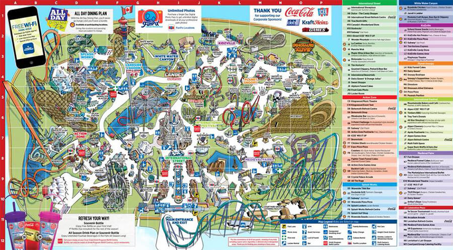
Canada’s Wonderland refines and makes readability improvements to their maps every year. Last year’s grid-system required constant cross-referencing, lengthening the process of finding an attraction.
2018 map: all roads are grey, lacking distinctiveness. Small text labels park sections 2019 map: the colourful roads differentiate sections and labels are gone
In a nutshell, Canada’s Wonderland did a fantastic job here. The complexity of information communicated in this fun and simple map is not only easier to digest, but impressive.
Be Inspired
Good design isn’t something that’s out of reach and reserved only for a few select geniuses. You don’t have to be designing the latest piece of cutting-edge technology to make an outstanding design.
With product design, consider two key things: 1) those interacting with your design and 2) how people use it. This will help you make smart design decisions, setting you apart from others.